Planet Bean
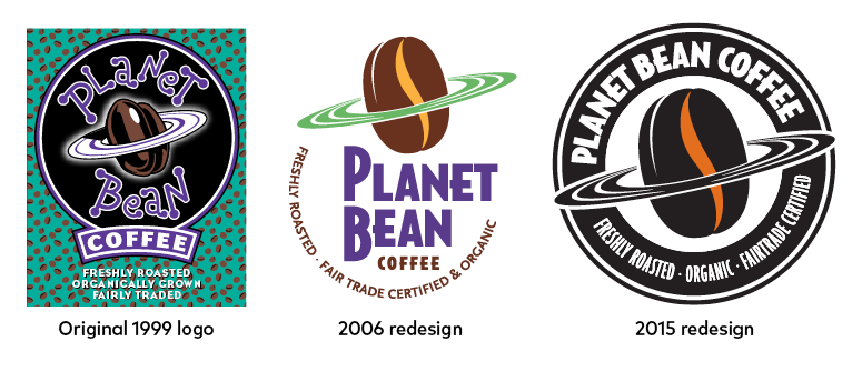
I have been this Guelph coffee roastery’s graphic designer since its founding in 1999. Planet Bean’s 2012 rebranding pushed its iconic ringed bean to the forefront. In 2015, matching cups were rolled out, which were redesigned for 2019.
RGD requested a case study of the packaging I designed for Planet Bean in 2013. When their website was updated in 2024, the case study went offline. I’ve republished it below.
Planet Bean Packaging Case Study
Written for RGD, 2014
Planet Bean Coffee is a coffee roastery in Guelph, Ontario. They have three coffee houses (all in Guelph) and sell their coffee wholesale to about 200 retail, office and foodservice customers in southern Ontario. Owned by a worker co-operative and positioned as a “do-good” company — Fairtrade certified (long before it was trendy) and certified organic (in all aspects of their coffee operations, including milk) — they are active in the community, promoting environmental and social justice initiatives.
As sole proprietor of Lind Design, I've been Planet Bean’s designer since it was founded in the mid-90s. I met founder Bill Barrett while working pro bono on social causes. When Barrett founded Planet Bean, he asked me to help with branding. I have worked on the company’s two logo makeovers, the most recent of which was in 2012, when the iconic ringed bean was brought to the forefront for greater brand recognition. The colour palette was sharpened to a distinctively minimal rusty orange and black.
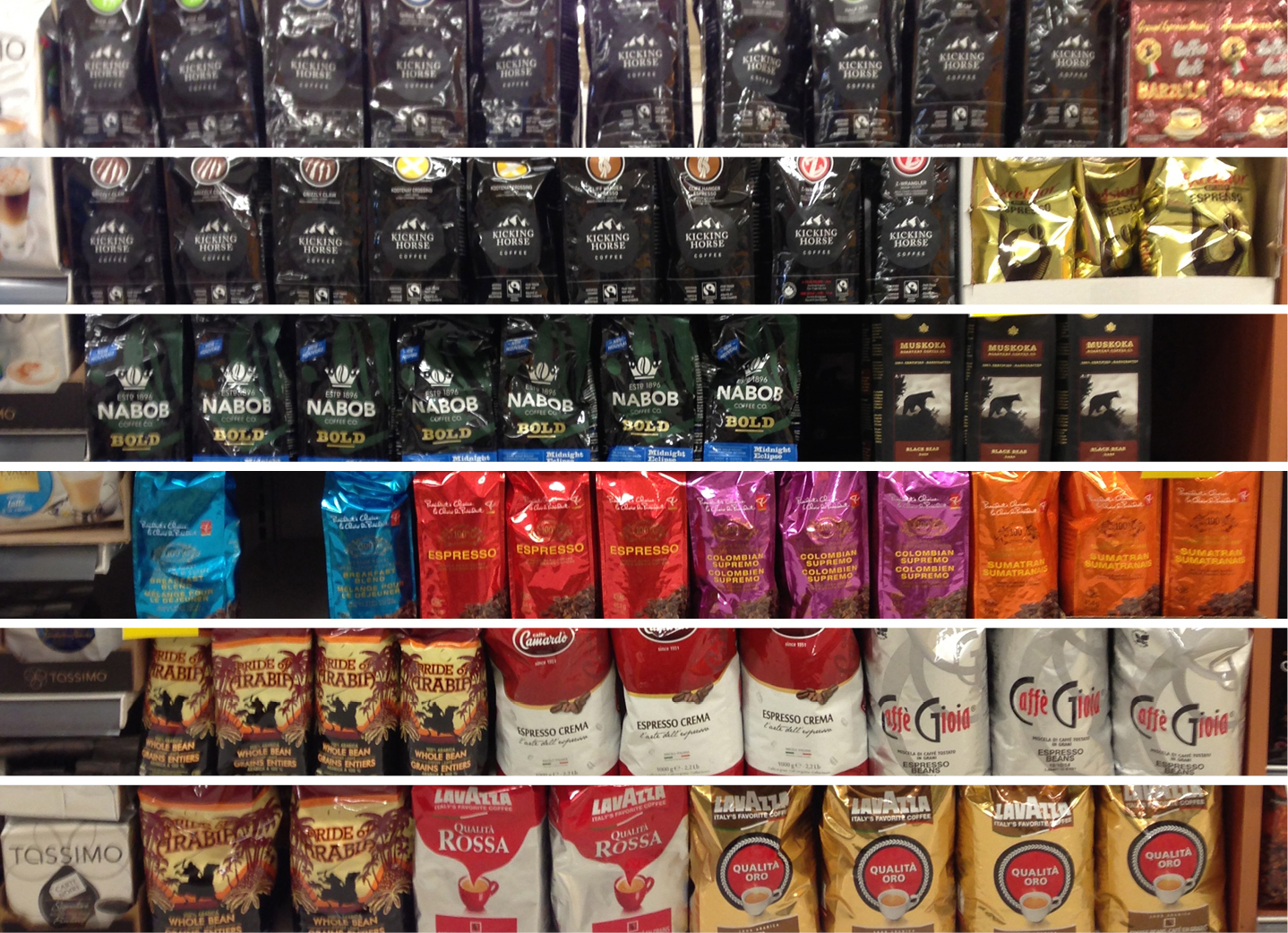
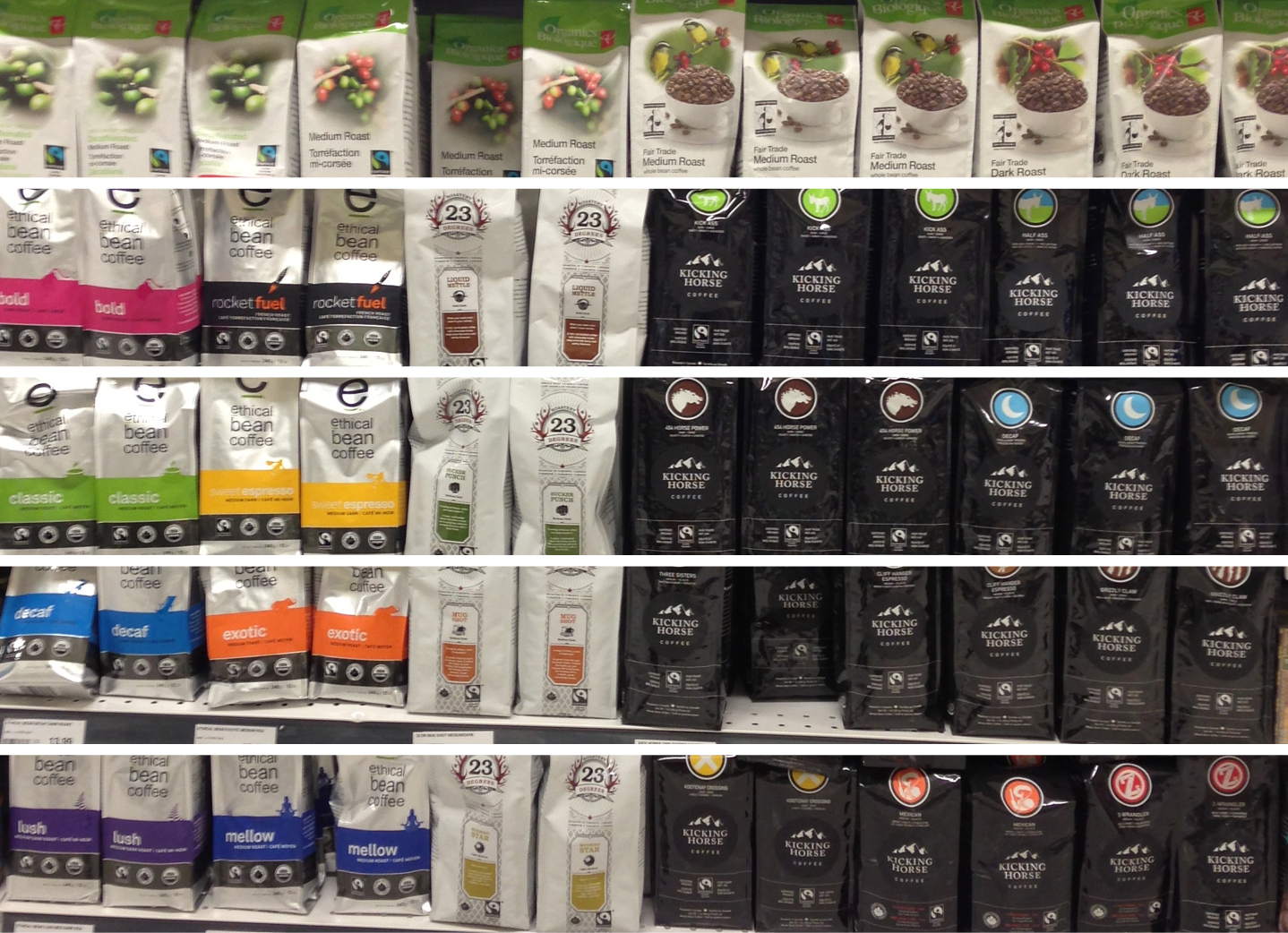
Coffee shelves in a supermarket, 2009
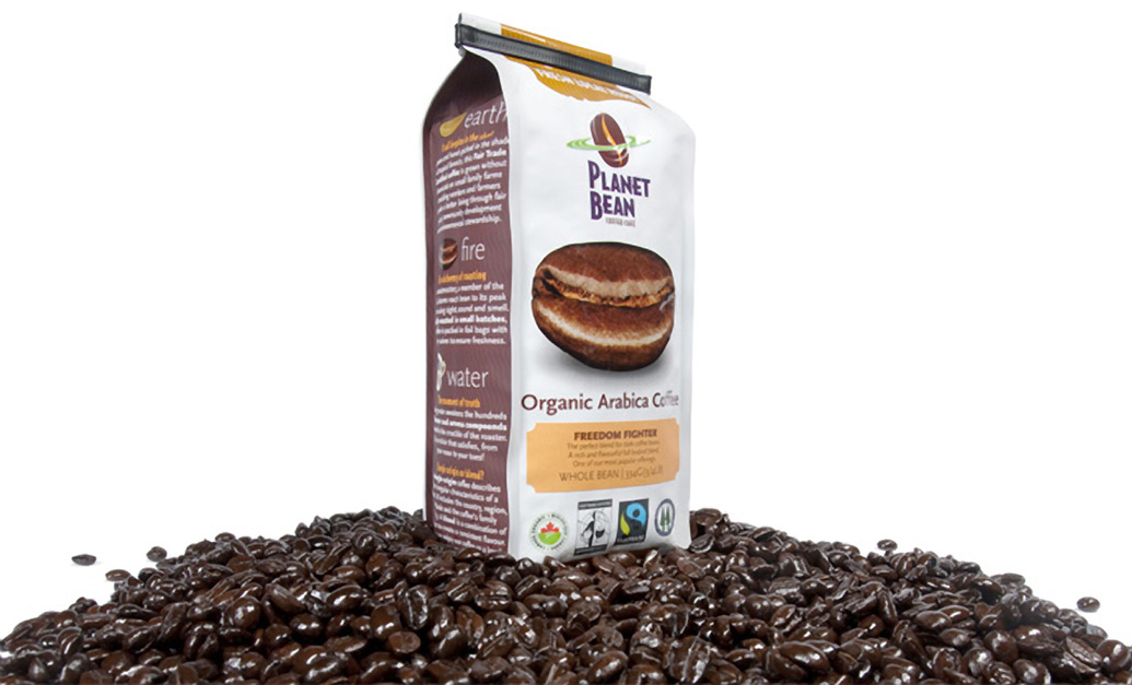
Planet Bean’s “One Bean” package design, 2010. Photo: Dean Palmer
2010: The White Bag
When Planet Bean started wholesaling, it distributed its coffee in generic black plastic bags, to which labels were affixed. In 2009, with strong growth, it was time to design packaging that would stand out on grocery stores shelves. An audit of coffee aisle shelves showed predominantly black or solid colour packages, with type-heavy designs, and a proliferation of images of loose coffee beans.
Few coffee companies at the time were using white. None were using a single, iconic image. With the phrase “there is only one planet Earth” in mind, Lind opted for a single, super-enlarged bean: One Bean on a simple white background. This photograph by Dean Palmer was retouched so that the crack in the bean formed a smile.
Planet Bean’s number one selling point: Nowhere else in Guelph can you purchase coffee as freshly roasted as at Planet Bean. So “fresh local roast” was proclaimed from a ribbon derived from the logo’s swirl — a facsimile of a bag seal. Also, this tagline capitalized on the burgeoning Buy Local movement. Because the coffee is roasted in small batches, with over 15 different origins and roasts, the design allowed for the client to affix die-cut labels in-house.
The package led to a jump in sales. As Bill Barrett puts it, “The new bag redefined us as a serious contender in the grocery coffee aisle. The bag spoke to the quality of its contents. The clean white base and fun smiley bean had immediate appeal, and retailers became more interested in our product.”
But the package became a victim of its own success. A competitor out of Toronto adopted a similar white bag. In just a few years, packaging everywhere had “lightened up.”
Coffee shelves in a supermarket, 2012
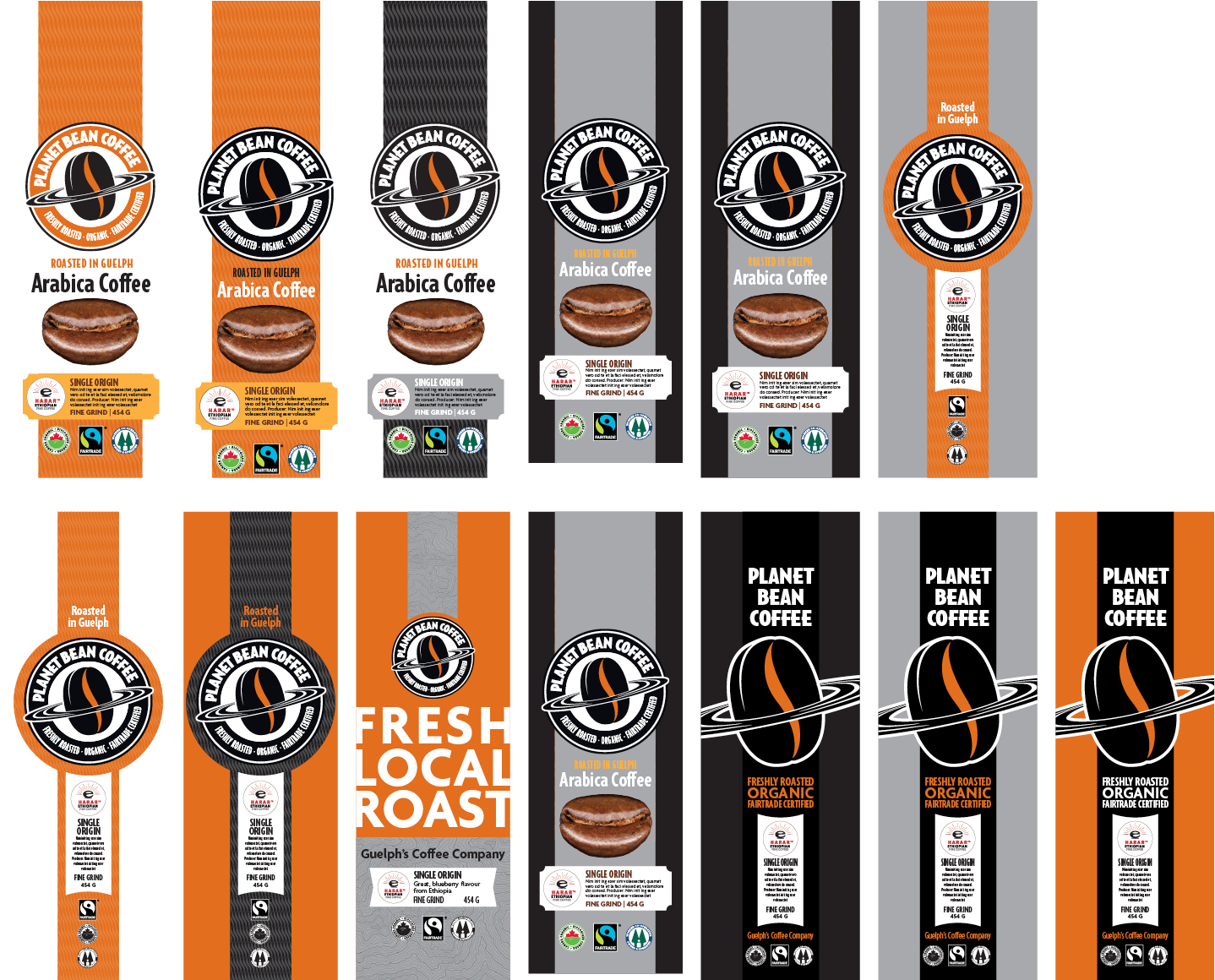
Early-stage design options for the front of the Planet Bean package, 2013
Design variations as mockups.
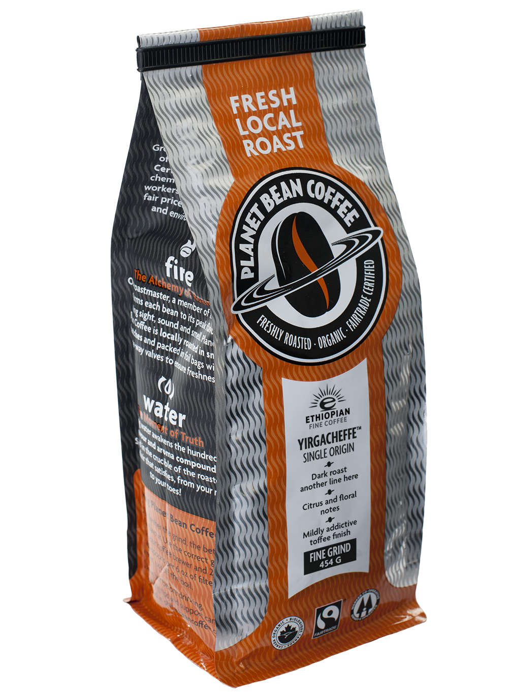
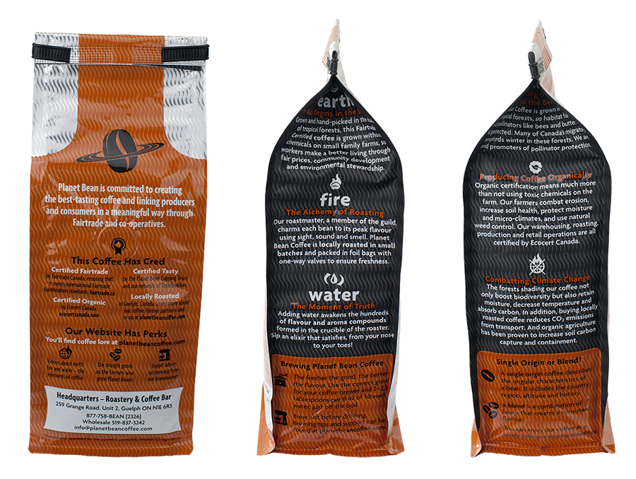
2014: The Foil Bag
In 2013, bag sales had actually declined, and Bill Barrett felt a new look was necessary to move more product. We had already laid the groundwork with a new logo design; the challenge was to come up with a package that once again stood out from the crowd. In 2010, one of the most successful aspects of the package had been the use of matte varnish to create a sophisticated feel. The sides had been matte (with gloss touches); the front had been gloss (the raw package material). The use of matte said “premium.”
I came up with the idea of letting the foil package show through, and printing a pattern of repeated swirls (one of the brand assets) with matte varnish to make the package seem to glimmer and flow. Because of the decision to limit the colour palette to black and a Pantone orange, the cost was for the equivalent of three colours rather than six — even with the extra varnish. A premium package at a budget price.
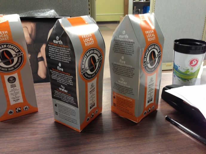
The design was a result of a close collaboration with Barrett, who produces all his retail display printing in-house. (It was Barrett's suggestion, for example, to drop the previous brown of the logo and go with black.) Barrett knows the coffee business — and has a good eye for design. Once the design had been shortlisted, we produced a number of mockups to ascertain how much foil was the right amount. It turned out that using foil on the package sides as well as the front flattened the design and impeded readability of the side text. Making the sides black made the front of the package pop.
Planet Bean’s limited distributional area (local roast!) meant that the package needn’t be bilingual (the client had handled the navigation of packaging regulations), freeing up a lot of real estate for design and text.
One problem with the previous bag was that it easily fell over on the shelf. Bags in disarray did not help sales! Barrett talked to Pacific Bag, a U.S.-based package printer, about finding a flat-bottomed bag. There was a brand new design on the market, but their U.S. plants did not yet have the technology. The new machines were only in China.
One Month for Proofs
Timeline was an issue: Current bags were nearly gone, and because the bag was being produced in China, the printer needed three months to produce new ones.
The project was started in June, 2013. With close collaboration, it was completed by the end of August — only to stall in the proofing stages. Hard proofing was necessary to check that the application of the matte varnish met expectations. It took over a month from approval of the PDF proofs to the delivery of the final tear sheet from the press.
But, in the end, the bags were delivered just before Christmas.
Photography: Dean Palmer
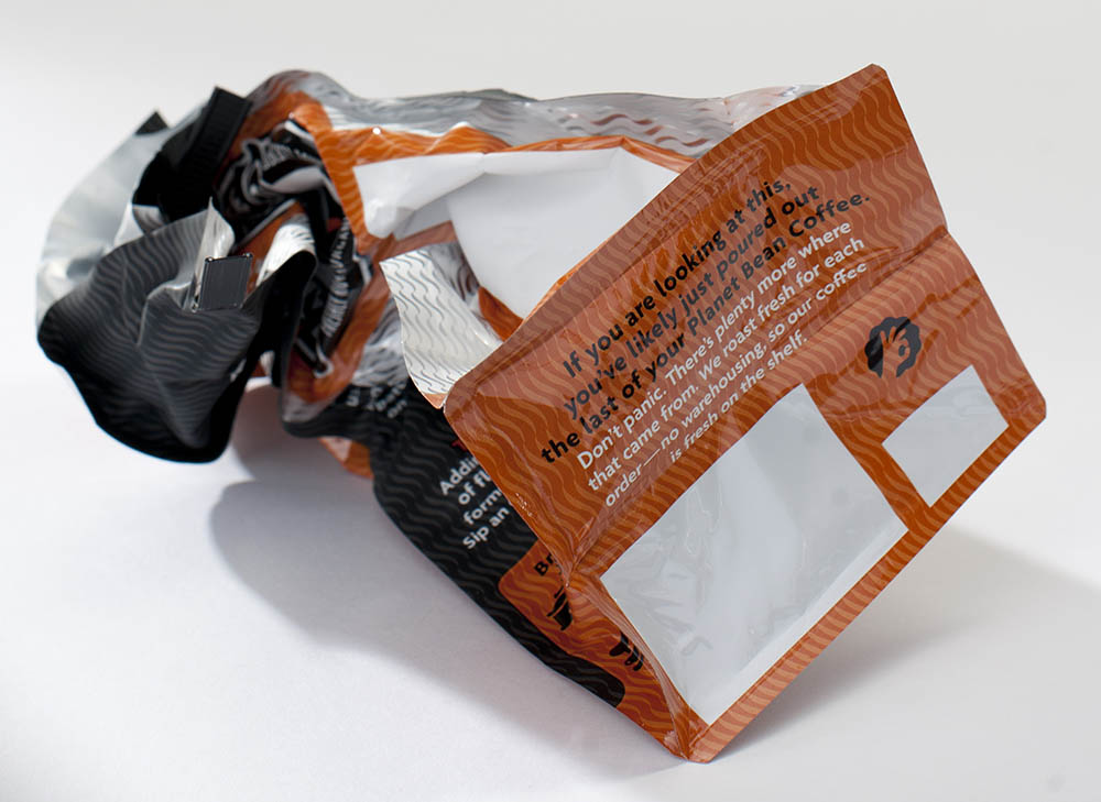
A Message on the Bottom
The logo is now at the forefront for greater brand recognition — and “fresh local roast” can’t be missed. The space for the customized label has now gone vertical, in a die-cut rounded ribbon form. This bold orange/black/silver palette is nowhere else to be found on the shelves.
Lind, who in addition to design writes copy and draws political cartoons, word-crafted the copy on the package. Even the bottom of the package was used to drive home the brand’s message: “If you are looking at this, you’re likely just poured out the last of your Planet Bean Coffee. Don’t panic. There’s plenty more where that came from. We roast fresh for each order — no warehousing, so our coffee is fresh on the shelf."
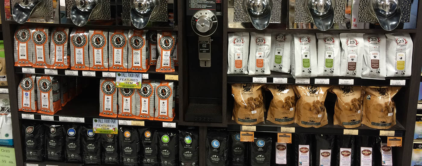
The Planet Bean package on Guelph grocery store shelves
Takeaways
- When designing packaging, consider the raw material on which it is to be printed. Can it play a role in the design? In this case, foil packaging was leveraged to act as a pricy metallic ink — at no extra cost. None of Planet Bean’s competitors is using this look. Yet.
- To avoid last-minute stress and surprises, be sure to allow ample proofing time into the project’s timeline. A month to receive proofs from China was not anticipated.
- Consider doing more with less. Often a more limited colour palette, for example, if used creatively, can be more effective than multiple colours and free up budget for varnishes.
- Don’t be afraid of client collaboration. Try to develop longterm relationships with clients who value design. Gareth Lind has worked with Planet Bean's Bill Barrett for nearly 20 years. A trusting, collaborative approach has evolved that keeps the design budget down — important for a small, co-operatively owned retail operation.
The new bag has now been fresh on shelves for nearly nine months. [Edit: this was written in 2014; as of 2024, this bag is still being used.] Although I wasn’t able to get the metrics in time for publication, Barrett says that after the introduction of the new design, the sales slump ended. “Sales went up to where they had been, and in some markets they actually increased."
”We wanted to stand out in a very crowded grocery category,” says Barrett. “Our own retail coffee bar outlets are built around a counter area that involves a lot of stainless steel highlighted by warm hardwood detailing. Very classy. The bag’s silver and orange picks up on this aesthetic and attracts the eye of consumers as they scan retail shelves in the grocery store. People want to pick up the bag, and once they see the mix of playful icons and text that outlines our values and focus on quality, they want to bring our bag home. The message on the bottom is just one of those little surprises that Gareth came up with that add to the charm of the package.
”The new design has certainly enhanced sales and drawn the envy of a few of our peers in the coffee world because of it’s non-traditional approach. Because Gareth is fairly omnivorous in his graphic design projects, and not specifically a package designer, we can approach things creatively first, drawing on his wide experience, then see how we can translate that creativity into a specific product.”
Overview of Projects
The Tinder SonnetsBook Design

Eramosa InstituteLogo Design
Knights FestLogo Design
SoundtrackBook Design
Urban Park GuelphLogo and Graphic Support for NGO

The SingularityBook Design

Cartographies of DisappearanceBook Design
Guelph Climate Action NetworkLogo and Graphic Support for NGO

Walking & StealingBook Design

ToxemiaBook Design
Is It Weather or Is It Climate ChangeBook Design
Cane | FireBook Design
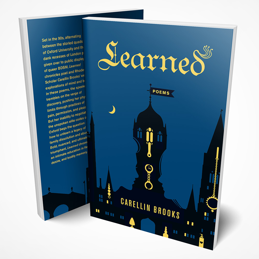
LearnedBook Design
Greenbelt West CoalitionLogo and Graphic Support for NGO
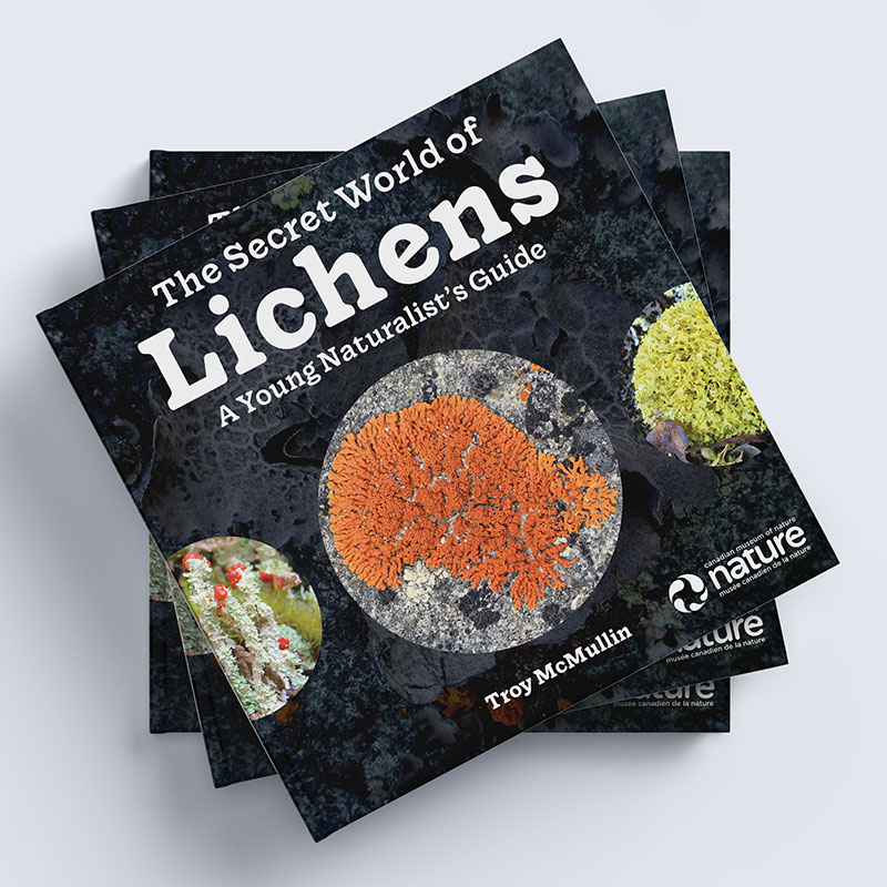
The Secret World of LichensBook Design
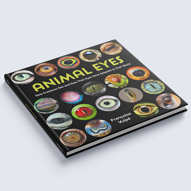
Animal EyesBook Design
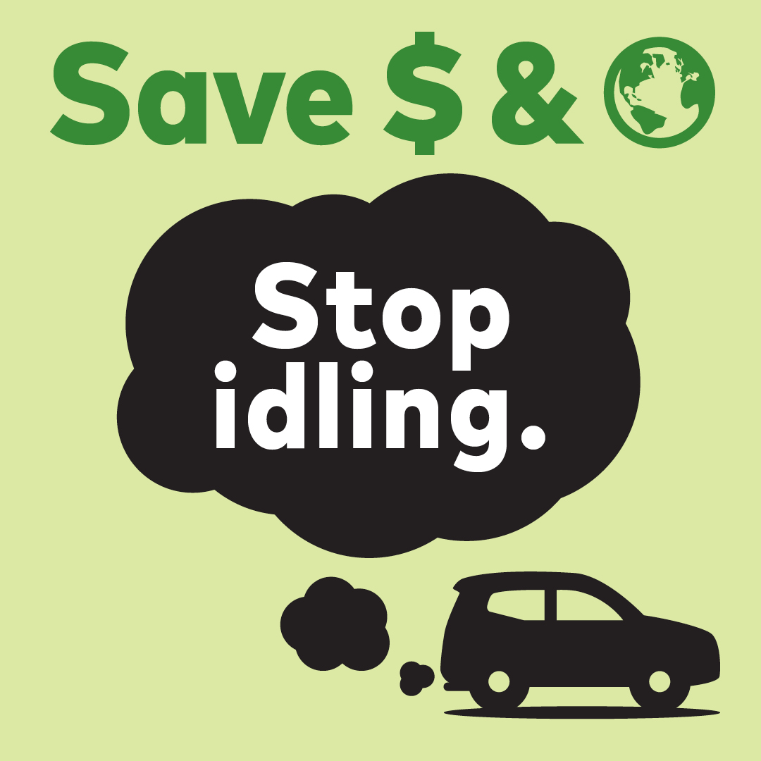
Stop Idling TicketEnvironmental Activism
Nikki Rodriguez Real EstateLogo Design
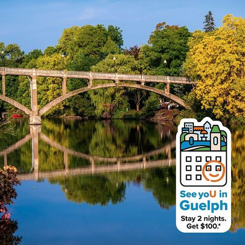
See yoU in GuelphDesign and Illustration
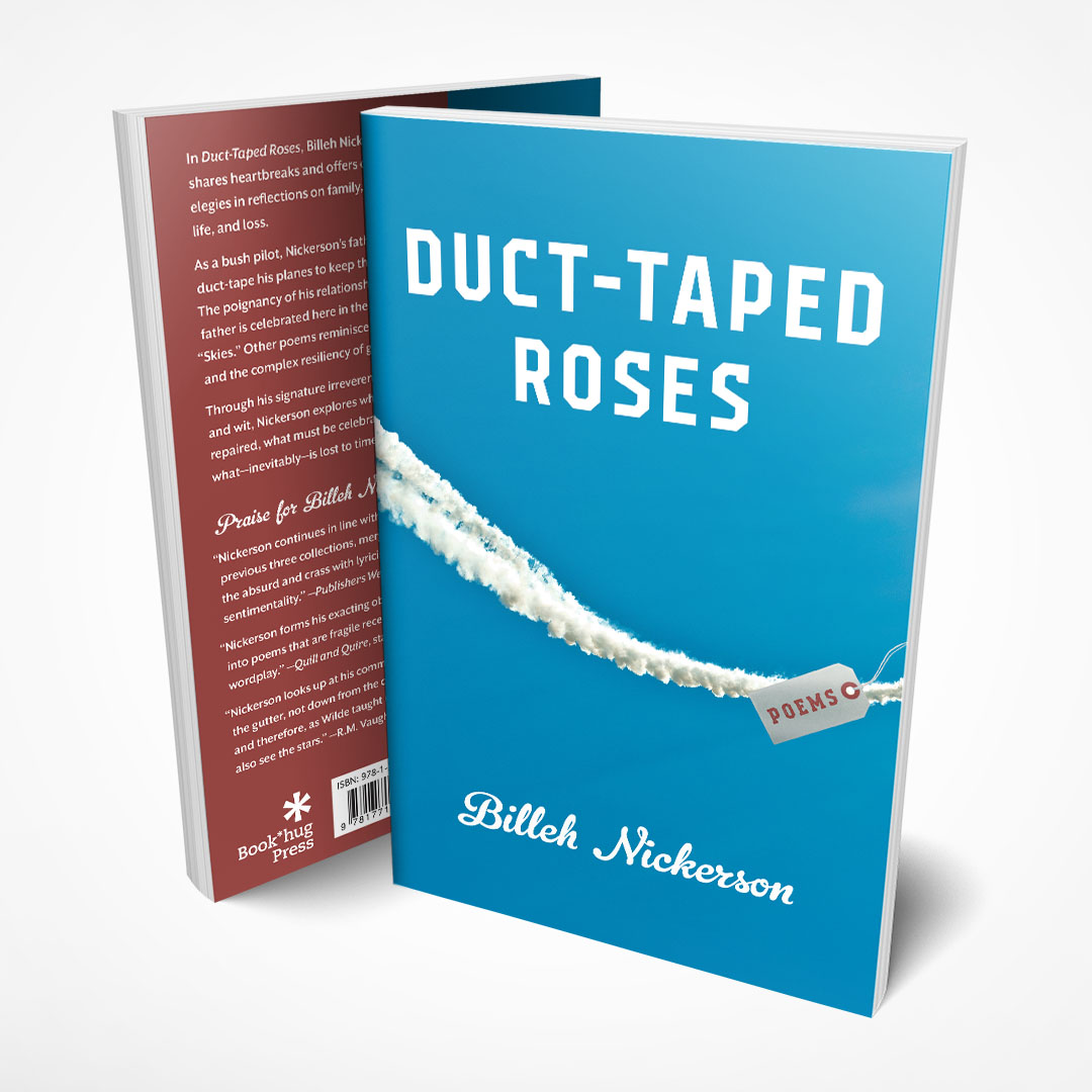
Duct-Taped RosesBook Cover
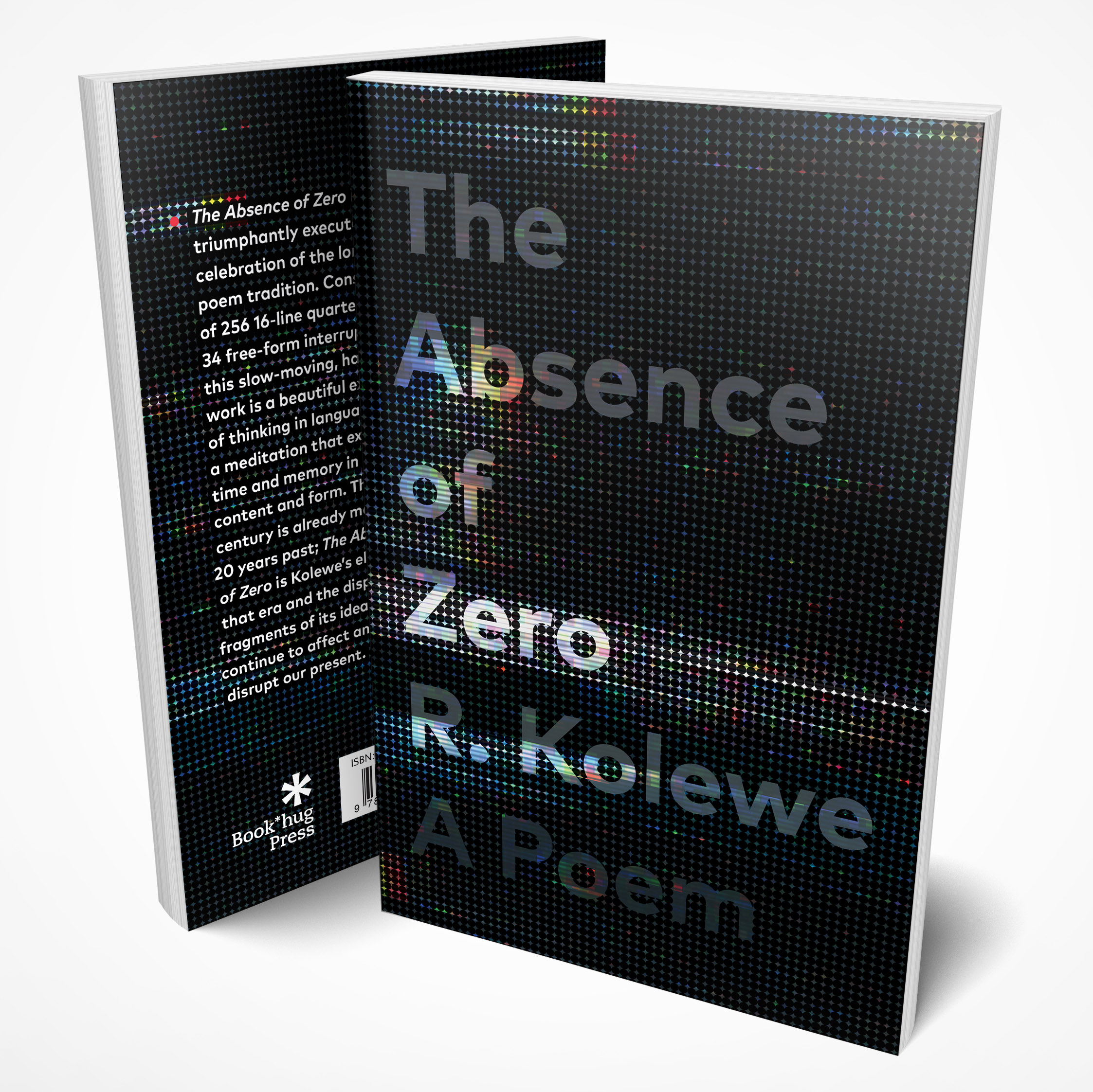
The Absence of ZeroBook Cover
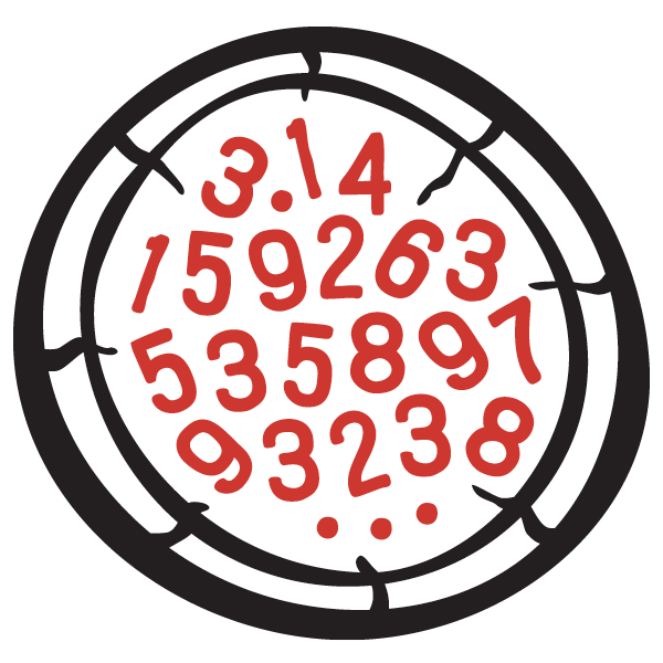
Pizza PiLogo Design
Hillside HomesideLogo Design
Guelph Chamber ChoirBranding
Jaywalking GuelphLogo Design
String Theory Yarn ShopLogo Design
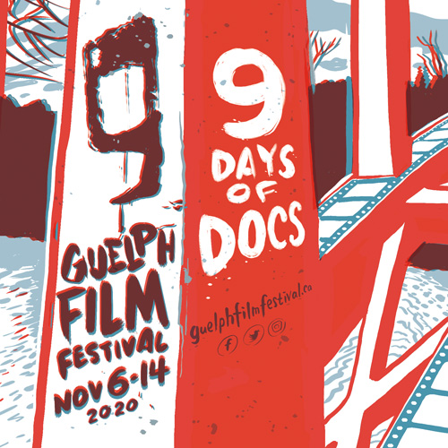
Guelph Film Festival 2020Illustration and Design
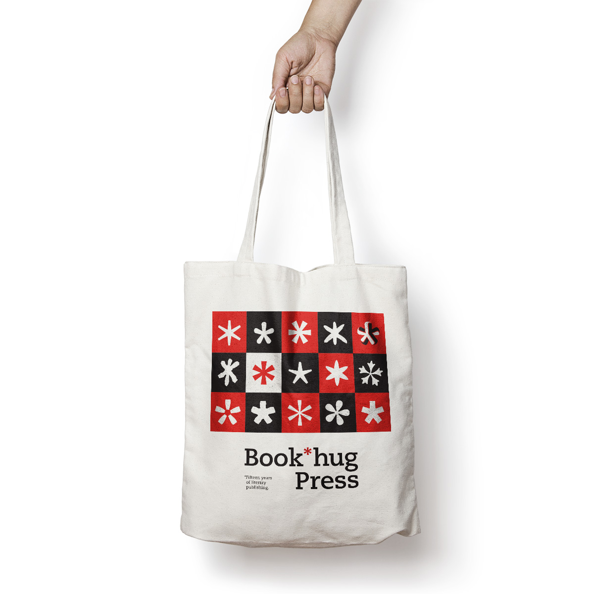
Book*hug PressBranding
TreeTrustLogo Design

Elevate GuelphLogo
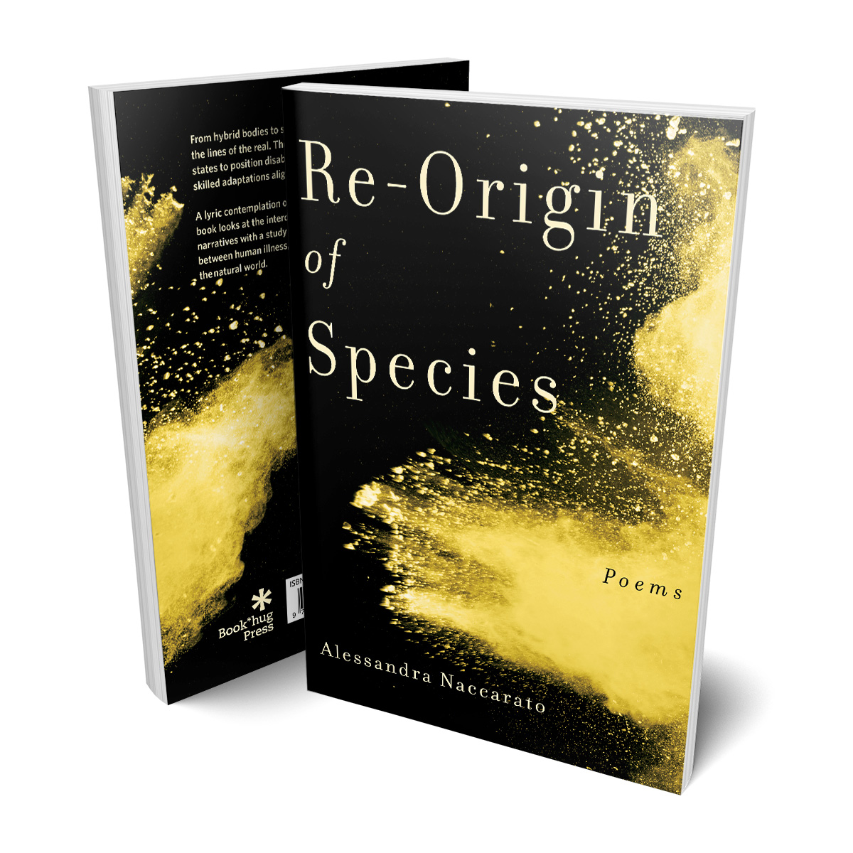
Re-Origin of SpeciesBook Design
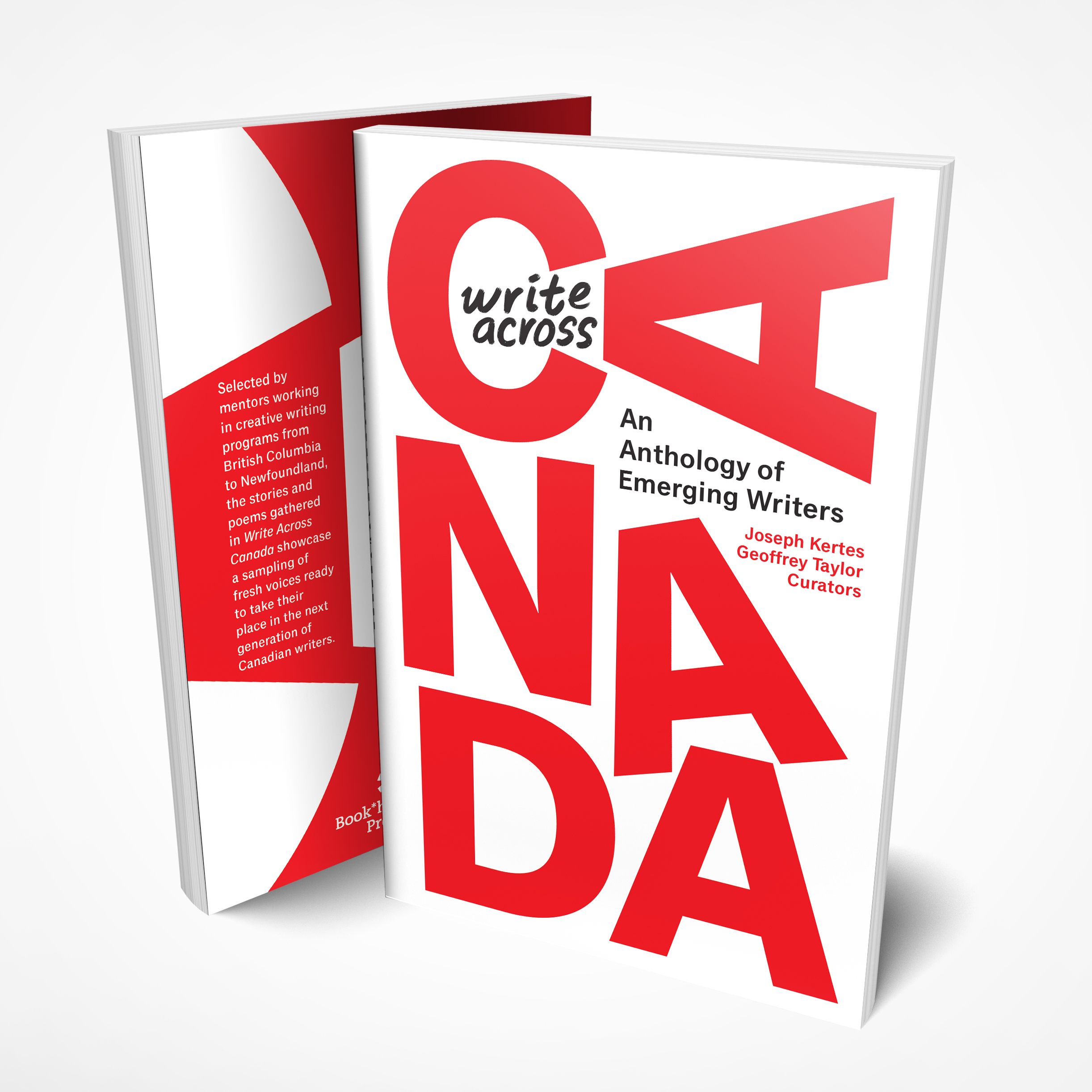
Write Across CanadaBook Cover
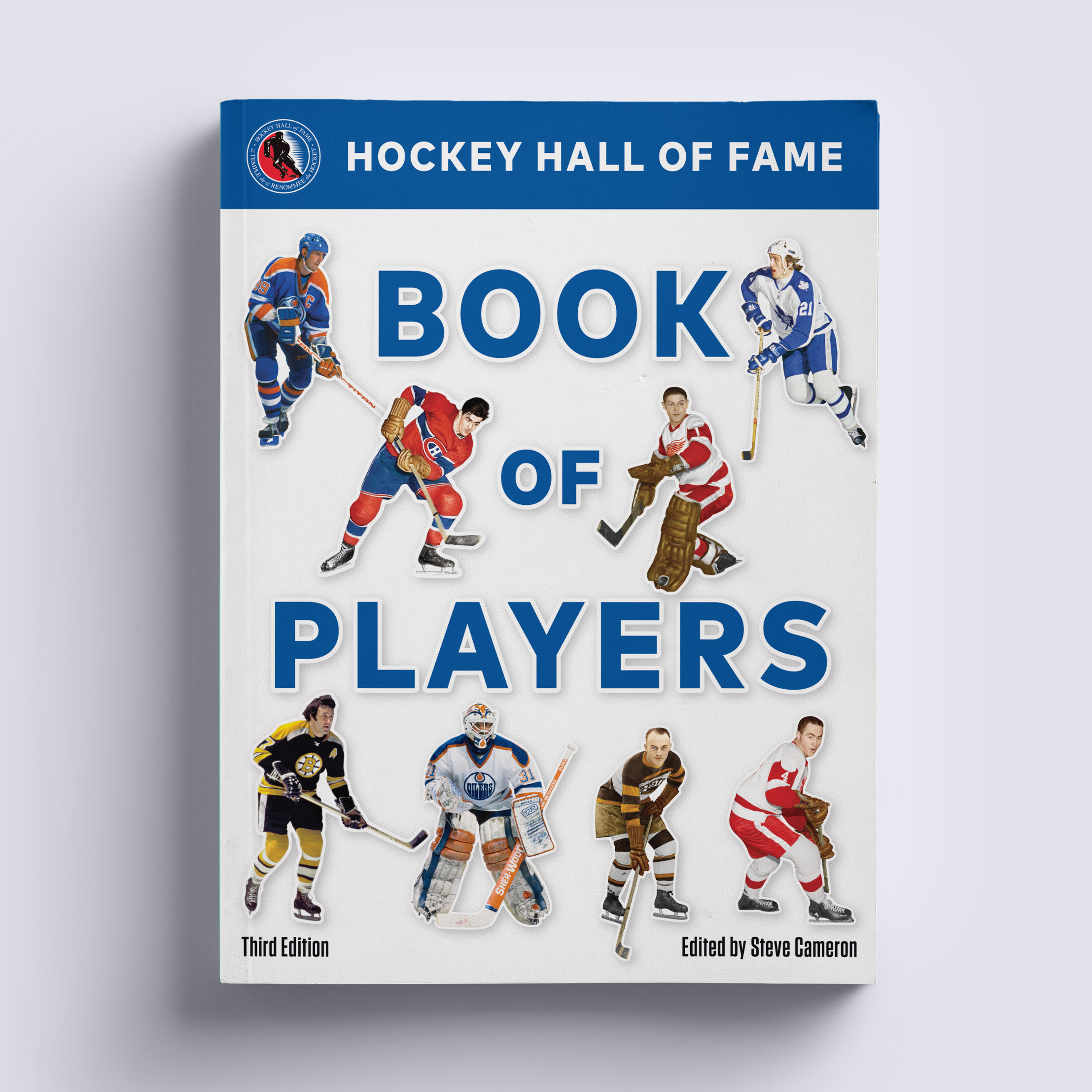
Hockey Hall of Fame Book of PlayersBook Cover Design
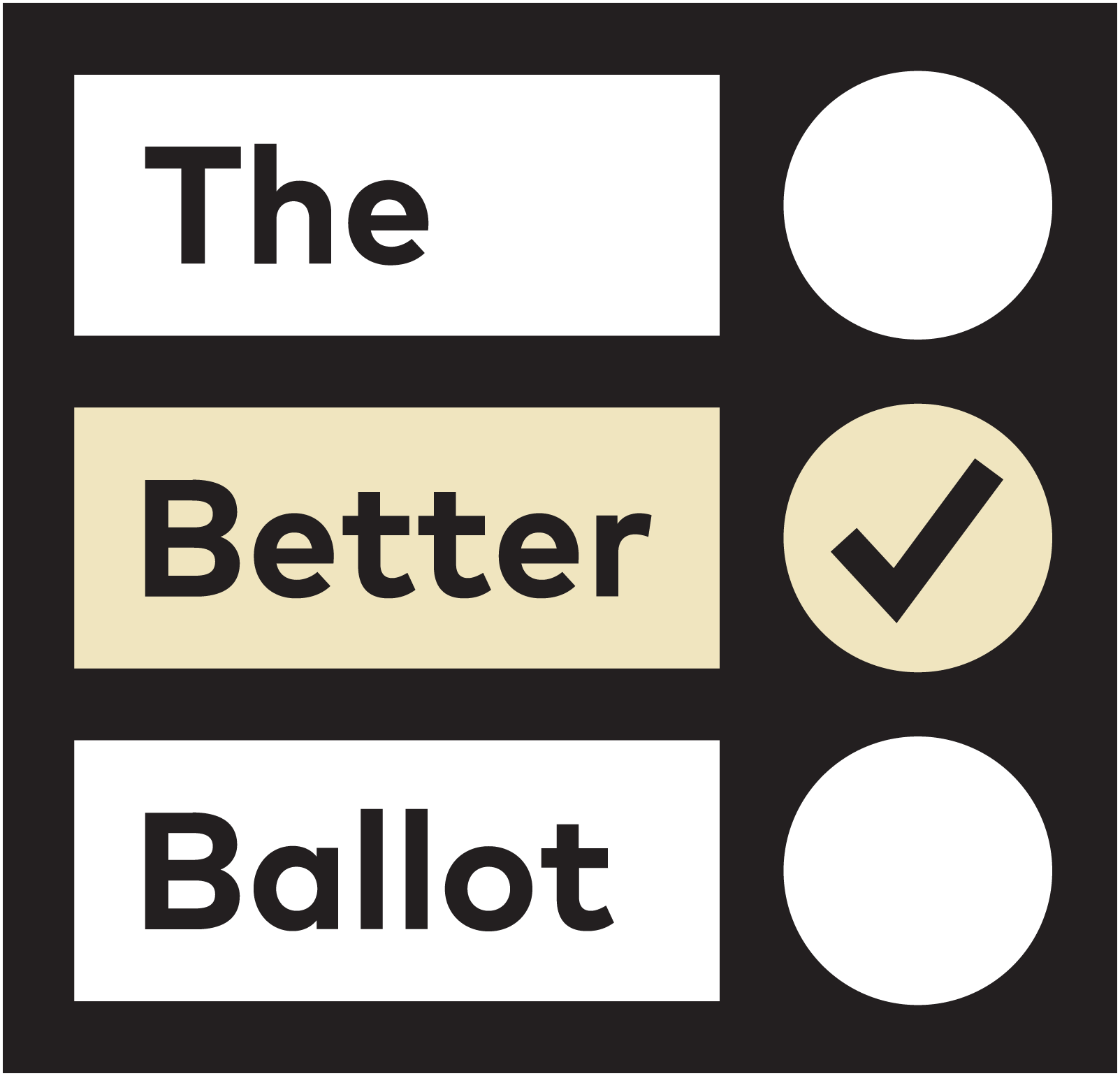
The Better BallotEthical Elections Campaign
Protect Our MoraineBranding
Dear Current OccupantBook Cover Design
PhantompainsBook Cover Design
Trina Koster PhotographyBranding
Guelph MuseumsCommunications and Exhibit Design
Guelph DancePromotional Design
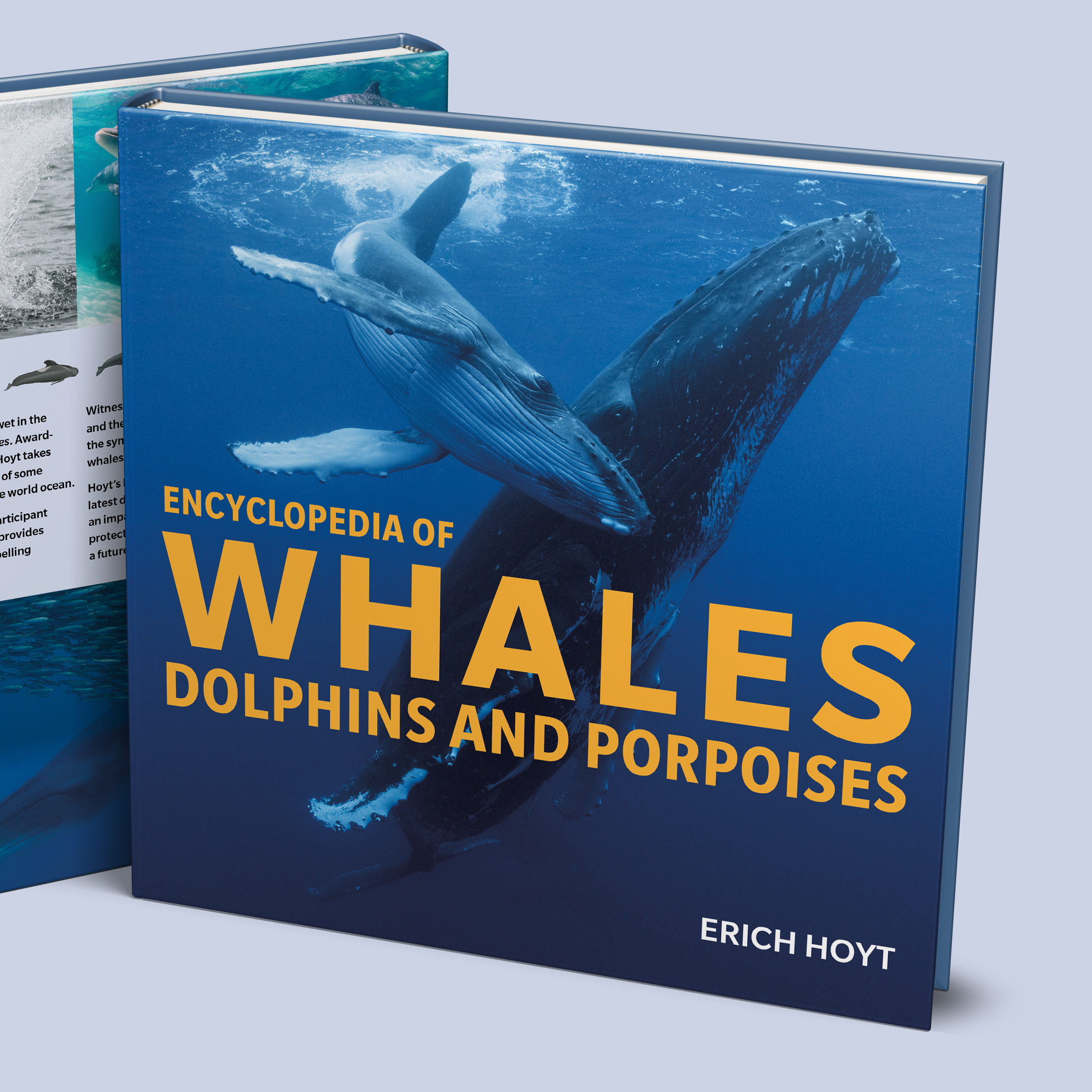
Encyclopedia of WhalesBook Design
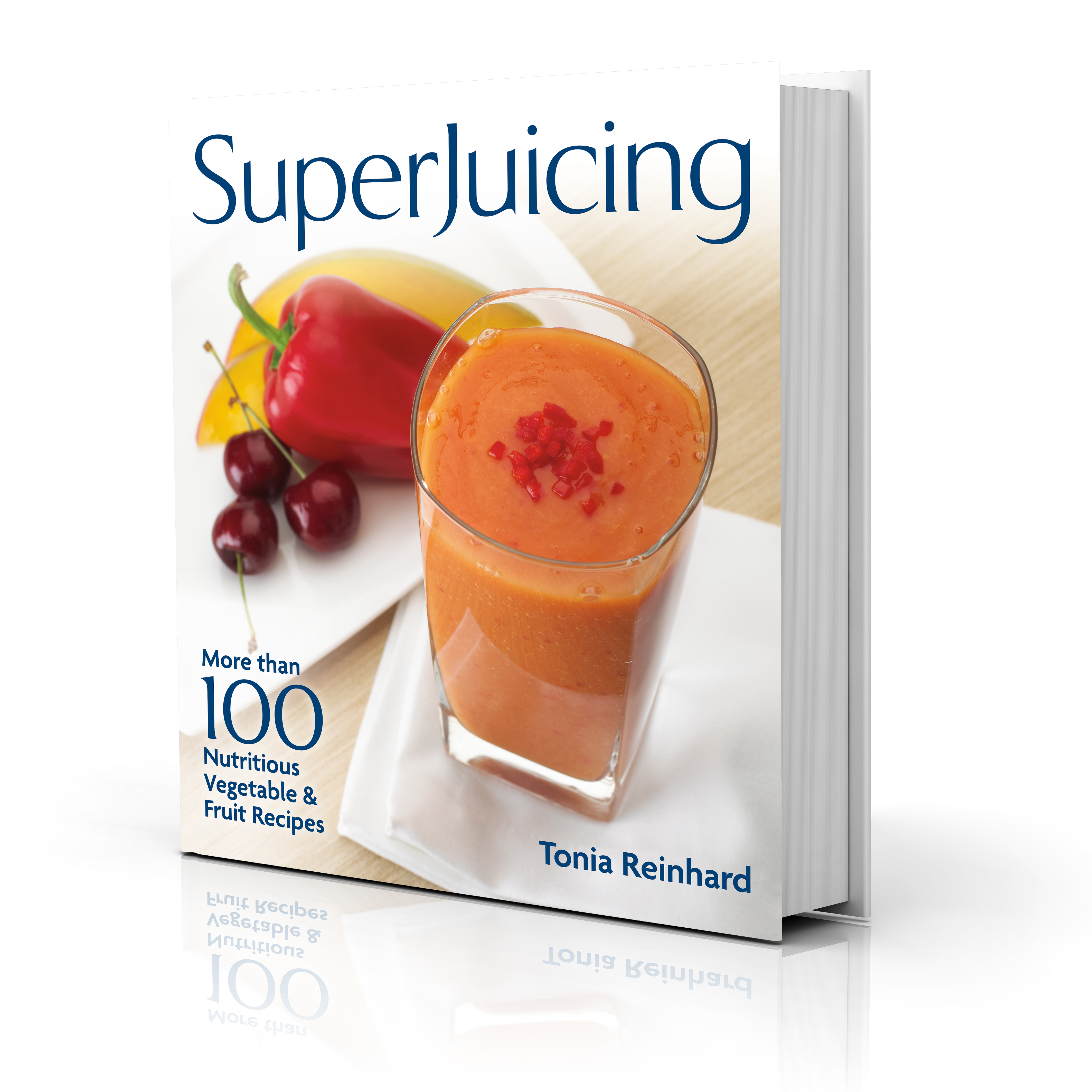
SuperJuicingBook Design
Doors Open GuelphBranding
Art Gallery of GuelphLogo and Identity
The AromatherapistBranding
Burlington Performing Arts CentreCommunications

Sol BeautyBranding
Hillside FestivalPromotion Design
Thomas VideoLogo Design
Against Cruise TestingGraphic Design in the 1980s Toronto Peace Movement
123 Woolwich Street
Suite 102
Guelph ON N1H 3V1
Email: [email protected]
Phone: 519 831 9833
© 2025 Lind Design