Trina Koster’s previous logo, above, included dated imagery that made it difficult to use in conjunction with her elegant photography. The new logo is below.

Trina Koster Photography
In business since 1995, Trina Koster Photography still had a logo that reflected that era and earlier — a cartoon silhouette of three Charlie’s Angels-style women holding cameras. Koster hadn't been looking for a new logo, but she wanted a brand refresh. I suggested that the logo looked dated and might project a sexist image, even though it did reflect that she her firm had three principal female photographers. Also, an image-based logo made it difficult to use in conjunction with her elegant photos, as it might clash with their style and subjects.
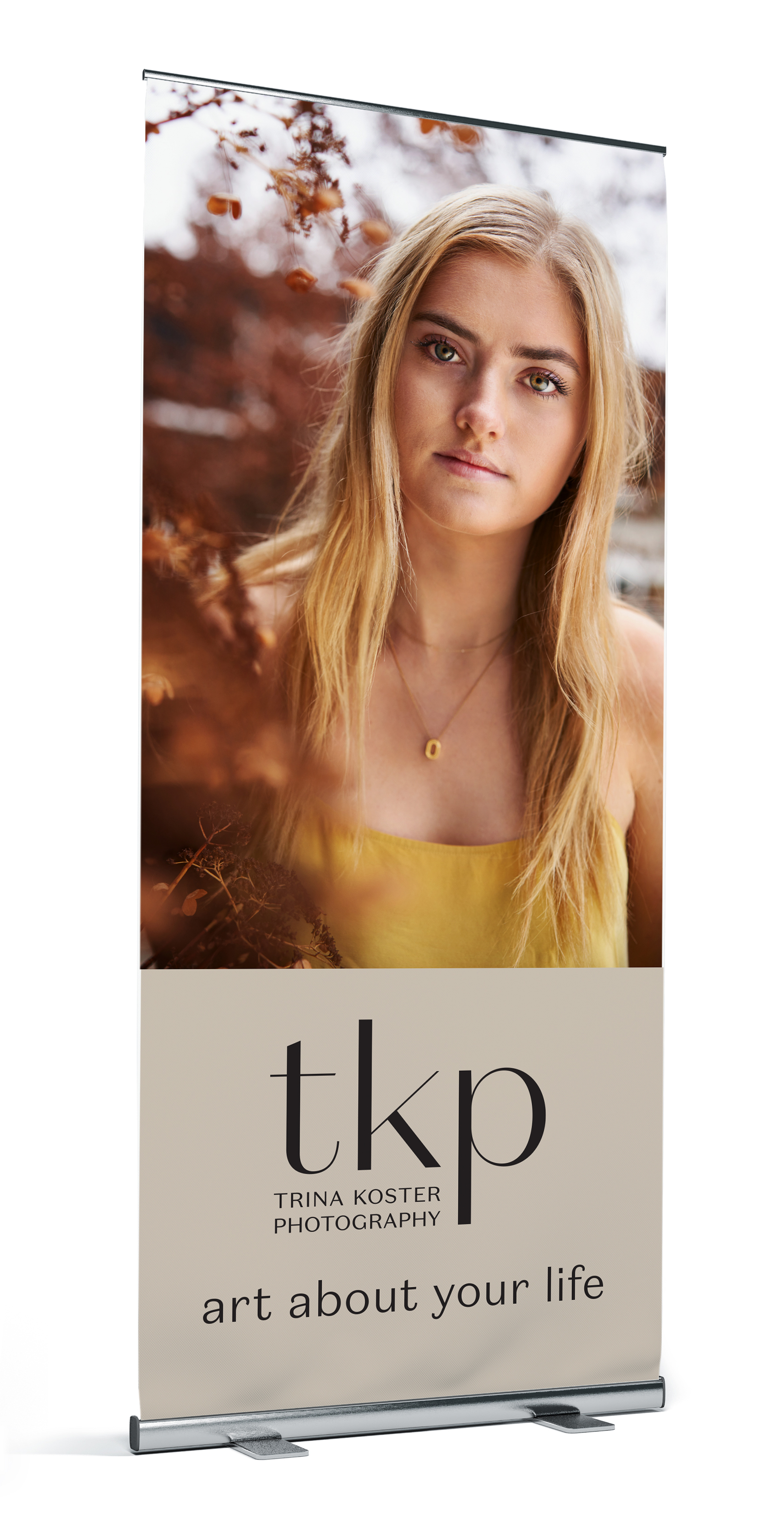
Instead of a brand refresh, Lind developed a whole new brand, with a stylish wordmark set in a font designed in New Zealand, Domaine Sans, which evoked classic fashion design. Logos often appear in conjunction with imagery, so they don’t need to carry all of a brand’s weight on their own.
The simple black-and-white colour scheme lets accompanying photography shine. Warm beige and friendly turquoise accent colours soften the look. The turquoise is used sparingly.


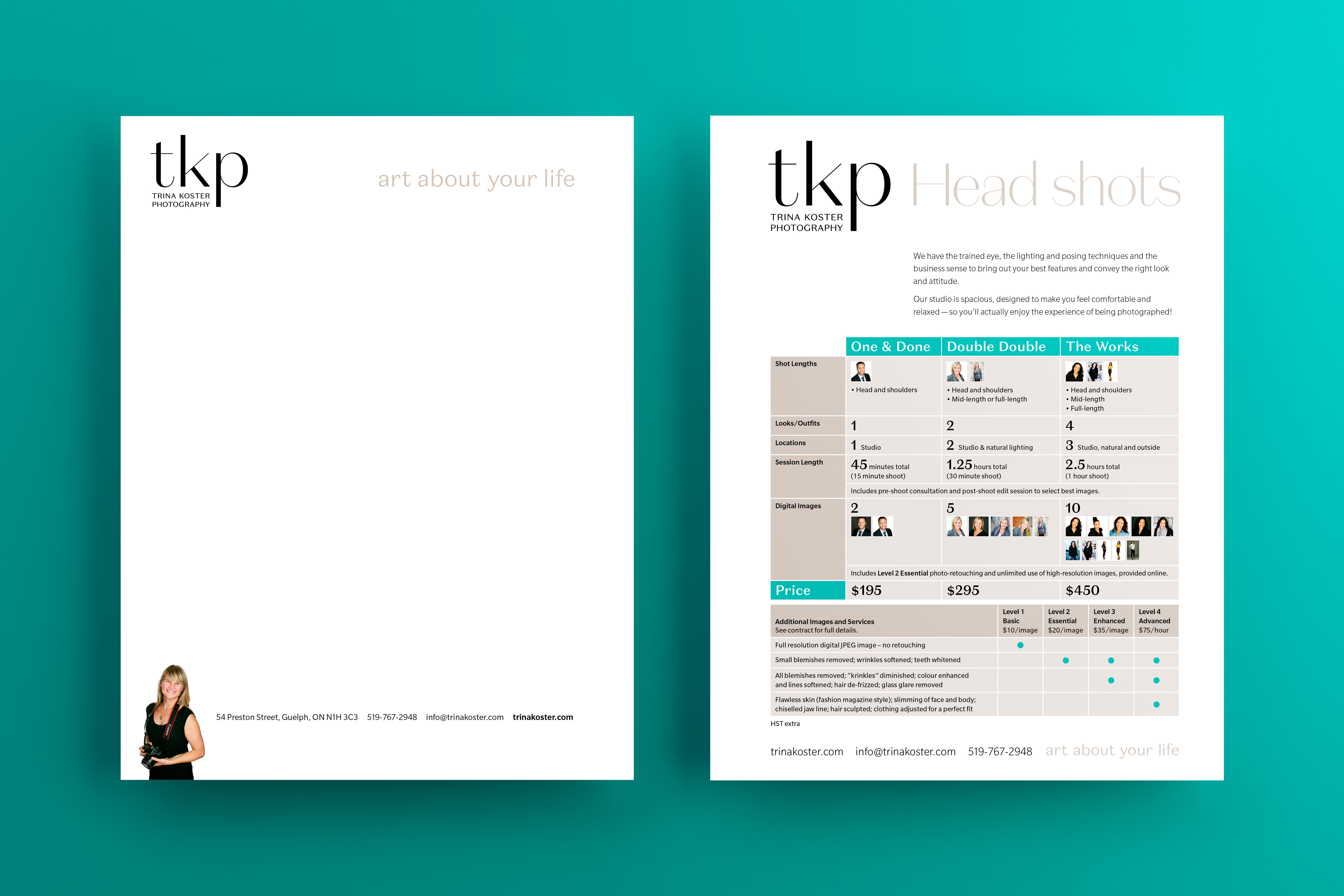
TKP specializes in head shots and has the process down to both an art and a science. Her challenge was to convey that to her clients. I helped her distill her services to the simple sheet (at left) and developed a series of sheets and contracts.
TKP specializes in head shots and has the process down to both an art and a science. Her challenge was to convey that to her clients. I helped her distill her services to the simple sheet (at left) and developed a series of sheets and contracts.
TKP specializes in head shots and has the process down to both an art and a science. Her challenge was to convey that to her clients. I helped her distill her services to the simple sheet and developed a series of sheets and contracts.
Overview of Projects
The Tinder SonnetsBook Design

Eramosa InstituteLogo Design
Knights FestLogo Design
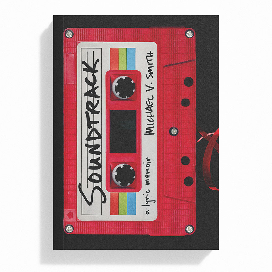
SoundtrackBook Design
Urban Park GuelphLogo and Graphic Support for NGO

The SingularityBook Design

Cartographies of DisappearanceBook Design
Guelph Climate Action NetworkLogo and Graphic Support for NGO

Walking & StealingBook Design

ToxemiaBook Design
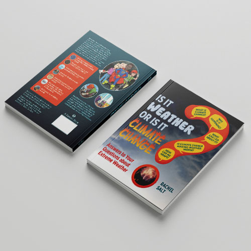
Is It Weather or Is It Climate ChangeBook Design
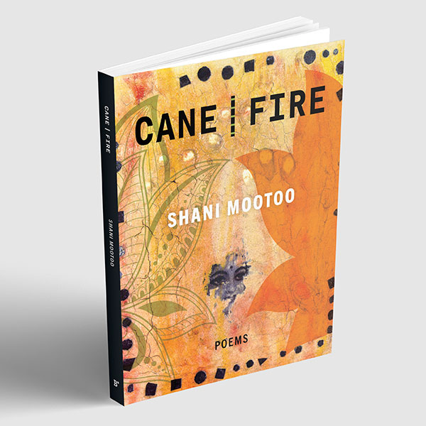
Cane | FireBook Design
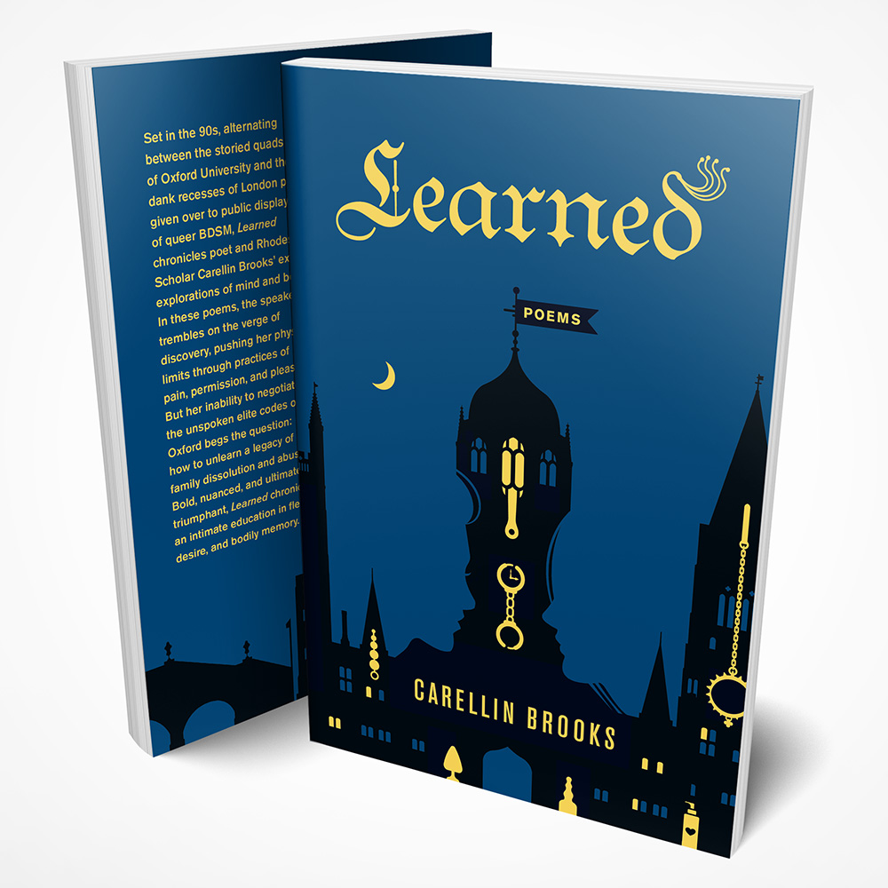
LearnedBook Design
Greenbelt West CoalitionLogo and Graphic Support for NGO
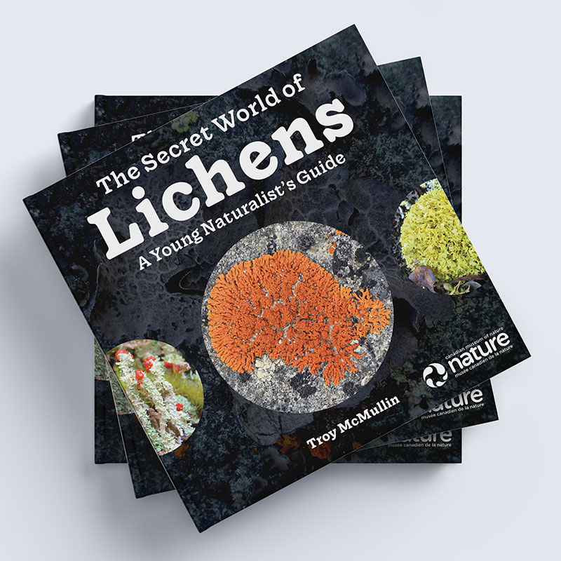
The Secret World of LichensBook Design
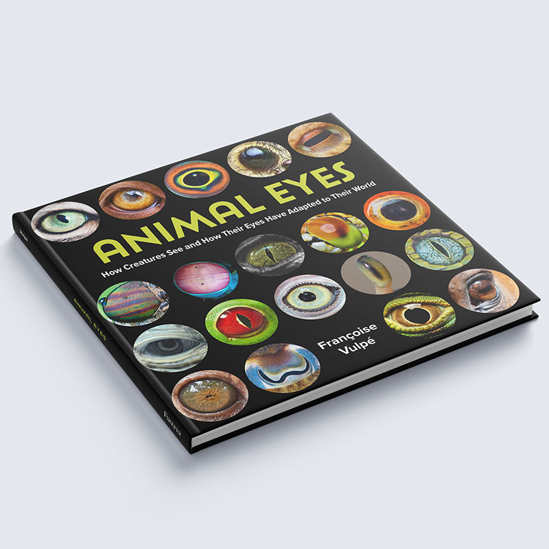
Animal EyesBook Design

Stop Idling TicketEnvironmental Activism
Nikki Rodriguez Real EstateLogo Design

See yoU in GuelphDesign and Illustration

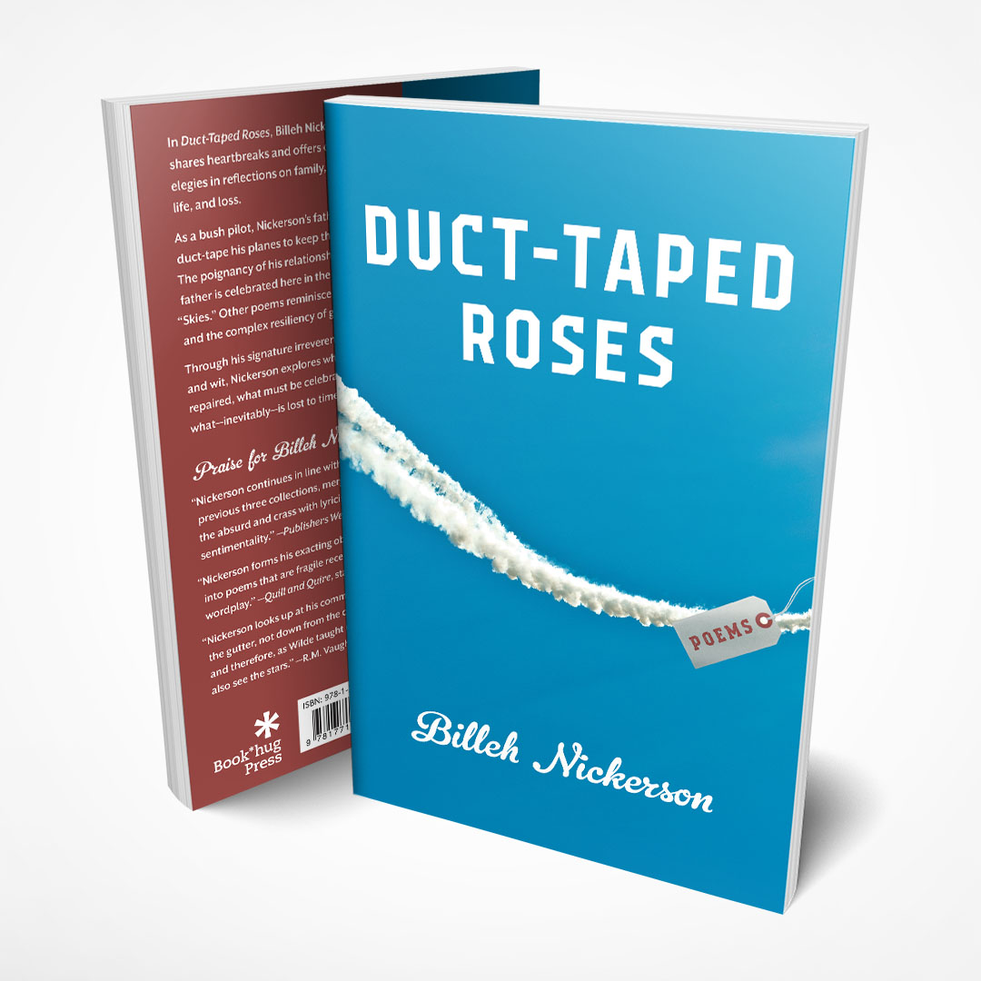
Duct-Taped RosesBook Cover

The Absence of ZeroBook Cover
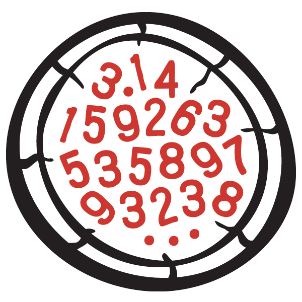
Pizza PiLogo Design
Hillside HomesideLogo Design
Guelph Chamber ChoirBranding
Jaywalking GuelphLogo Design
String Theory Yarn ShopLogo Design
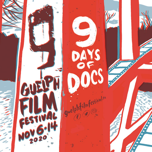
Guelph Film Festival 2020Illustration and Design
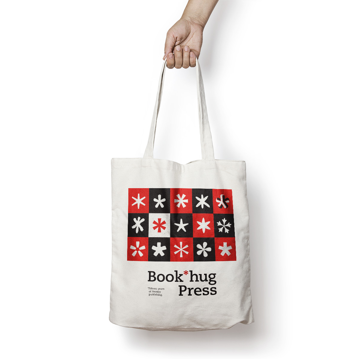
Book*hug PressBranding
TreeTrustLogo Design

Elevate GuelphLogo
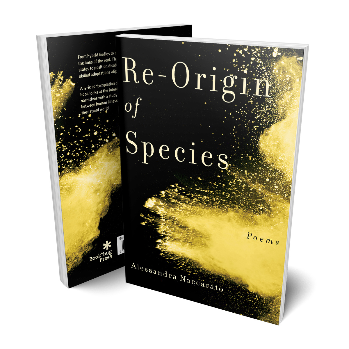
Re-Origin of SpeciesBook Design
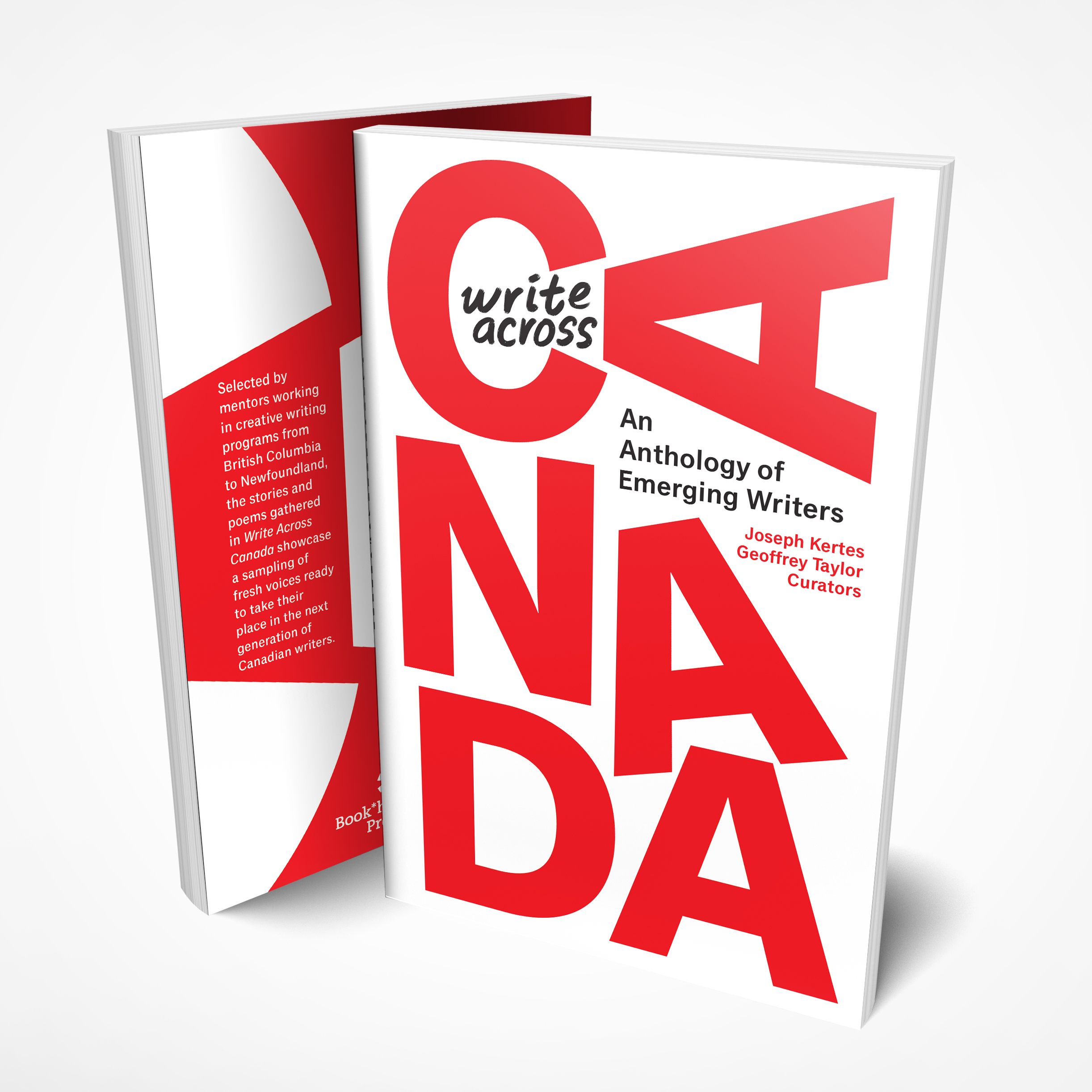
Write Across CanadaBook Cover

Hockey Hall of Fame Book of PlayersBook Cover Design
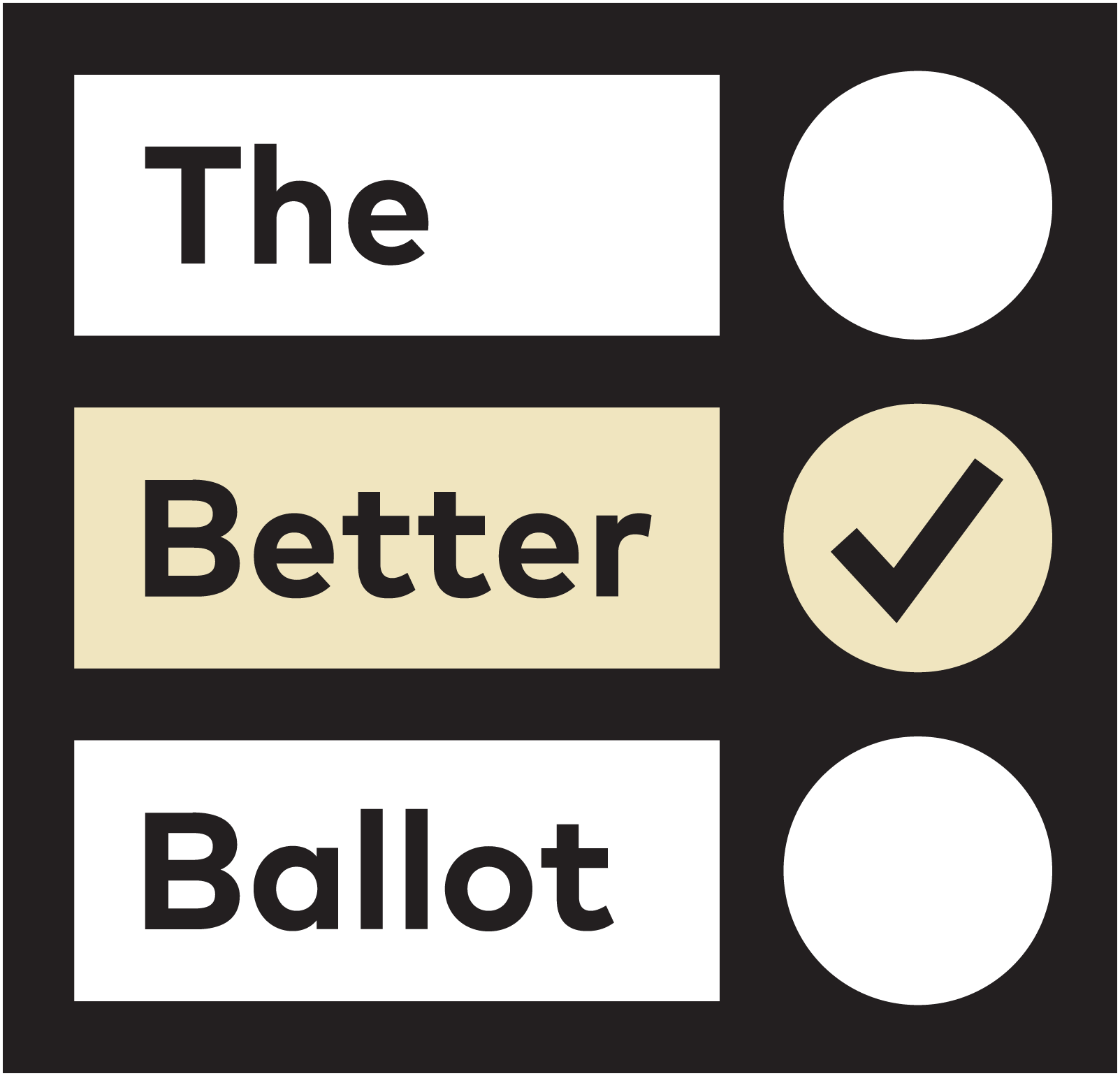
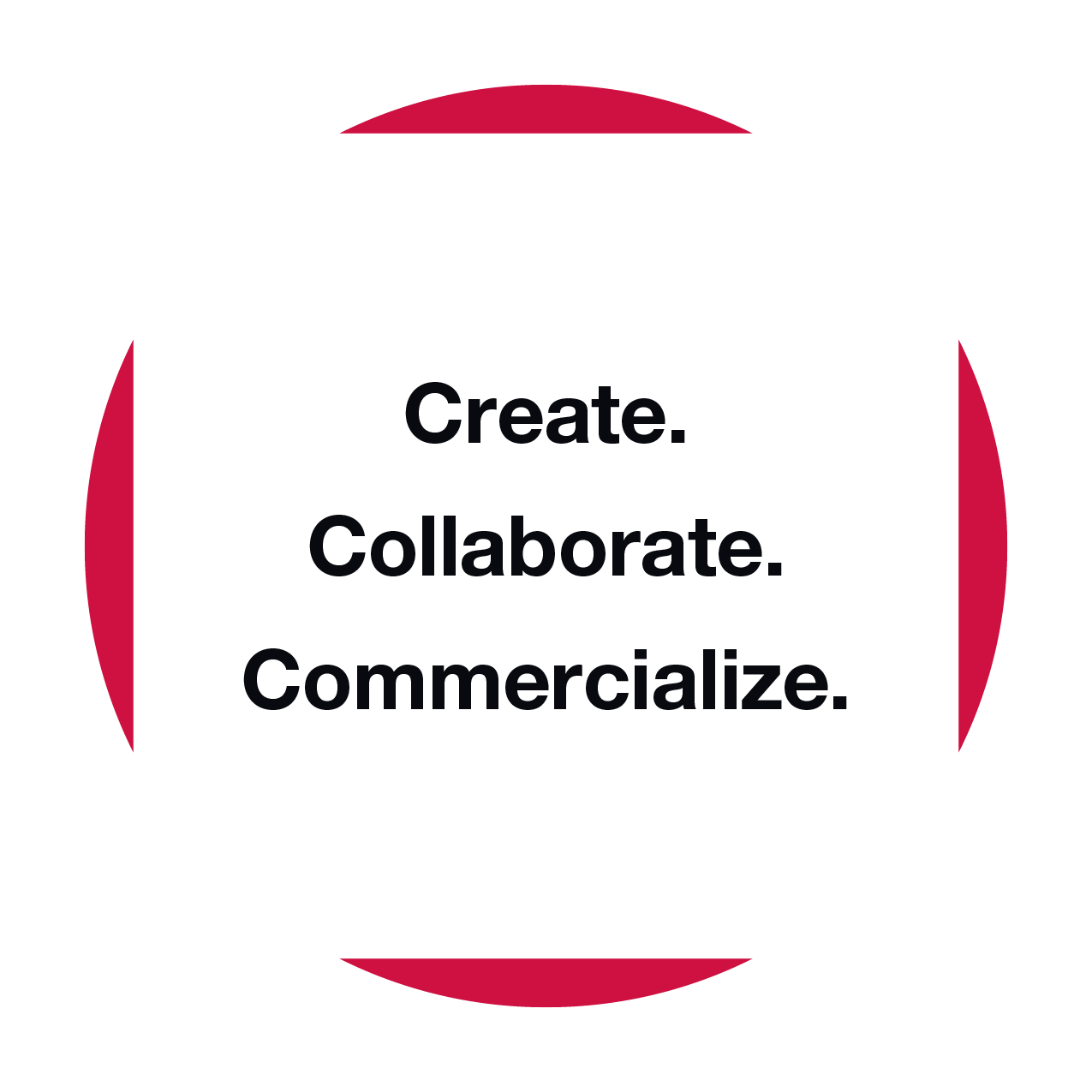
The Better BallotEthical Elections Campaign
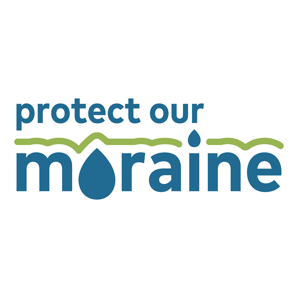
Protect Our MoraineBranding
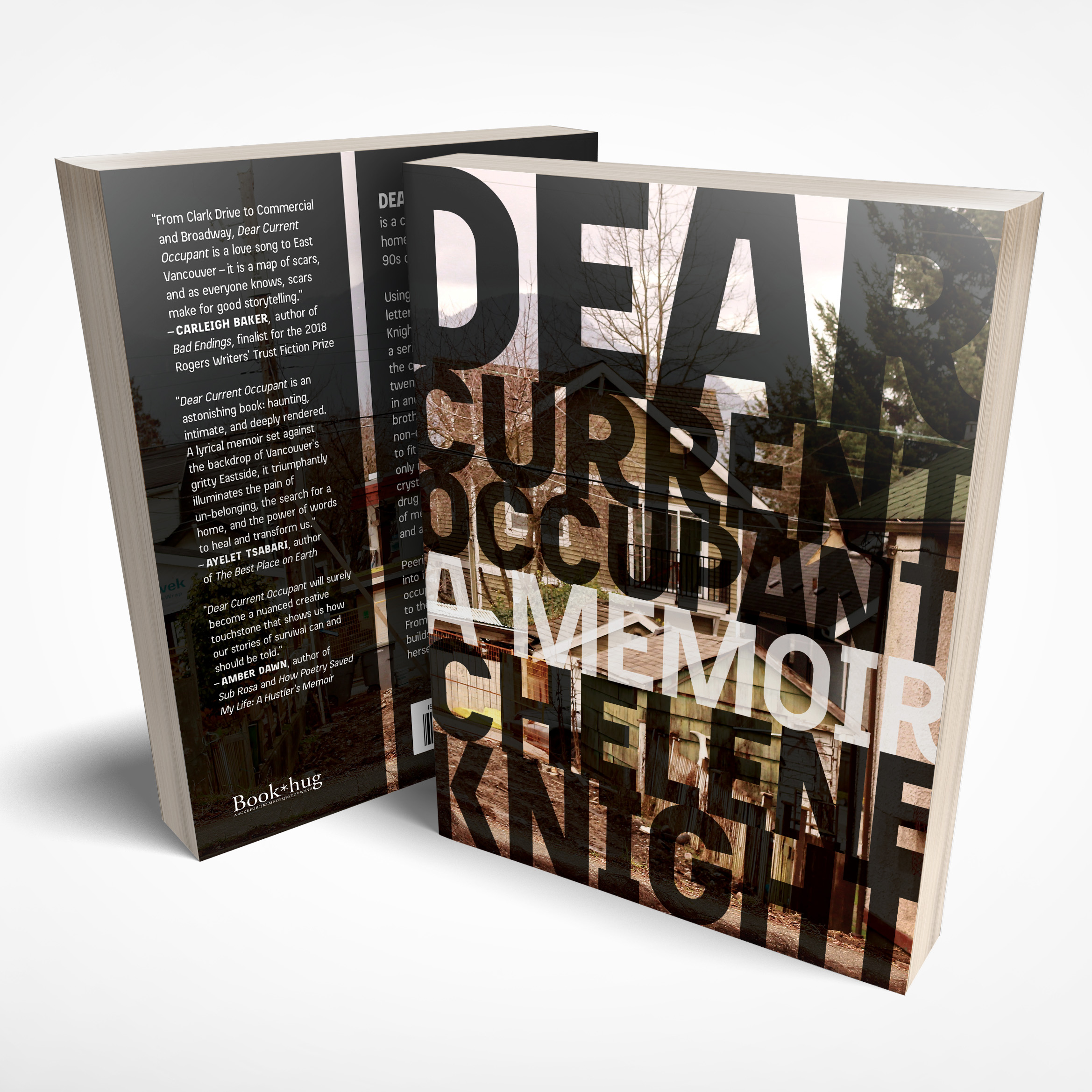
Dear Current OccupantBook Cover Design
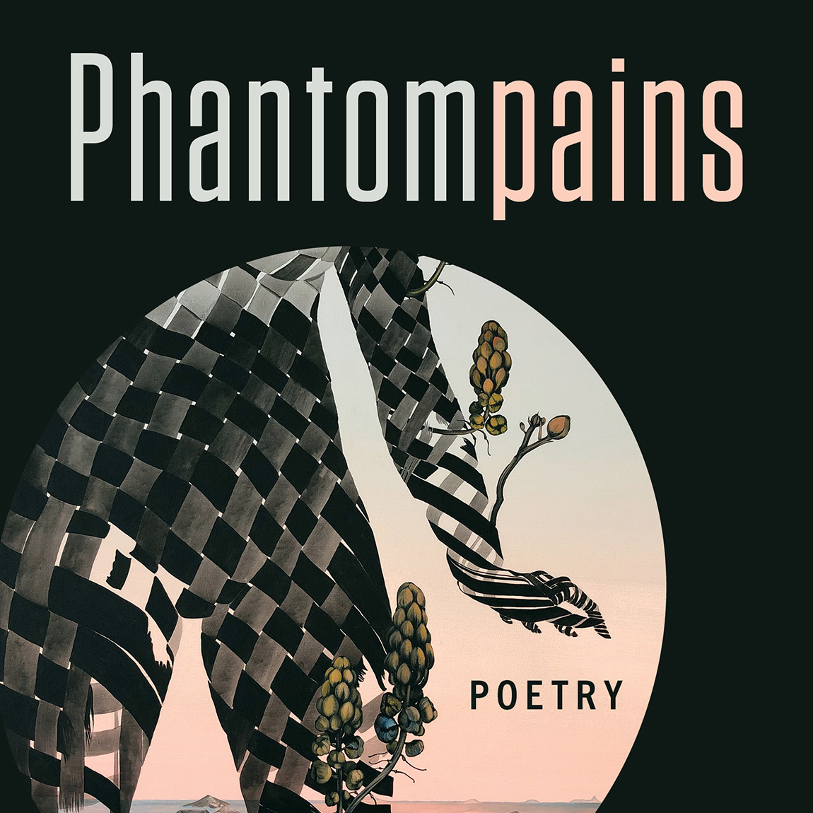
PhantompainsBook Cover Design

Guelph MuseumsCommunications and Exhibit Design
Guelph DancePromotional Design
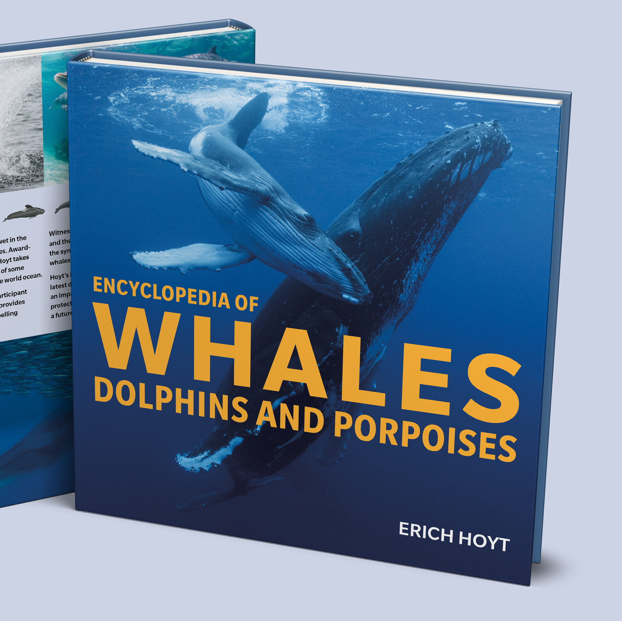
Encyclopedia of WhalesBook Design

SuperJuicingBook Design
Doors Open GuelphBranding
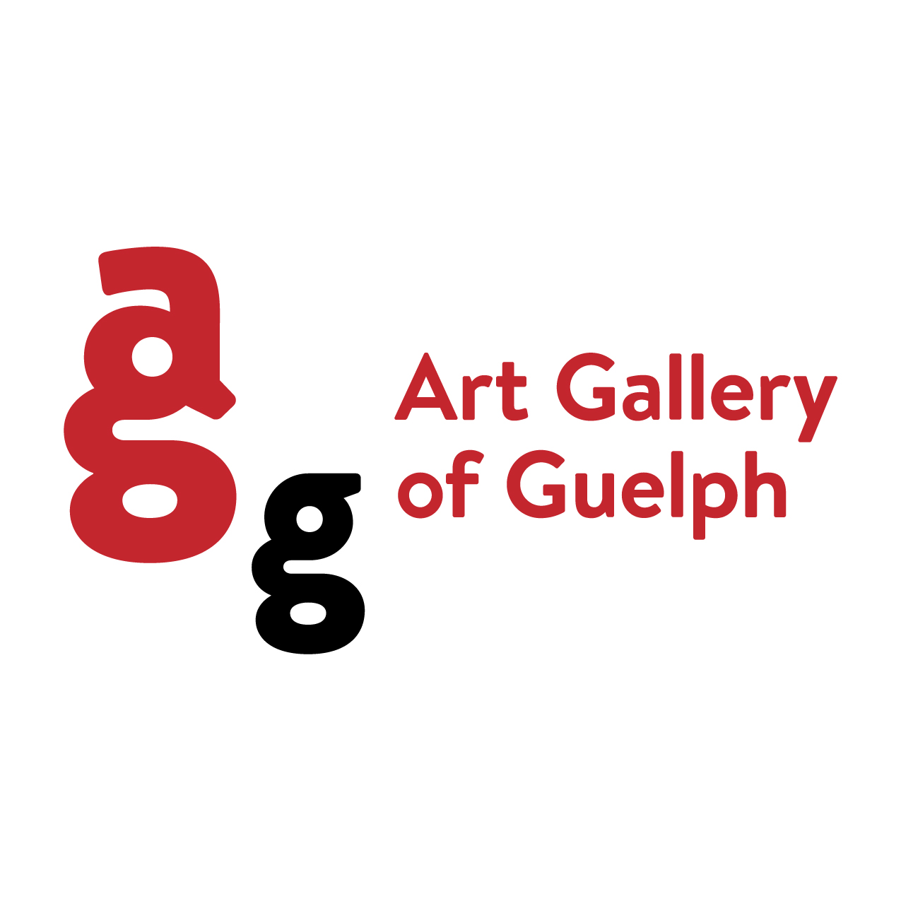
Art Gallery of GuelphLogo and Identity

The AromatherapistBranding
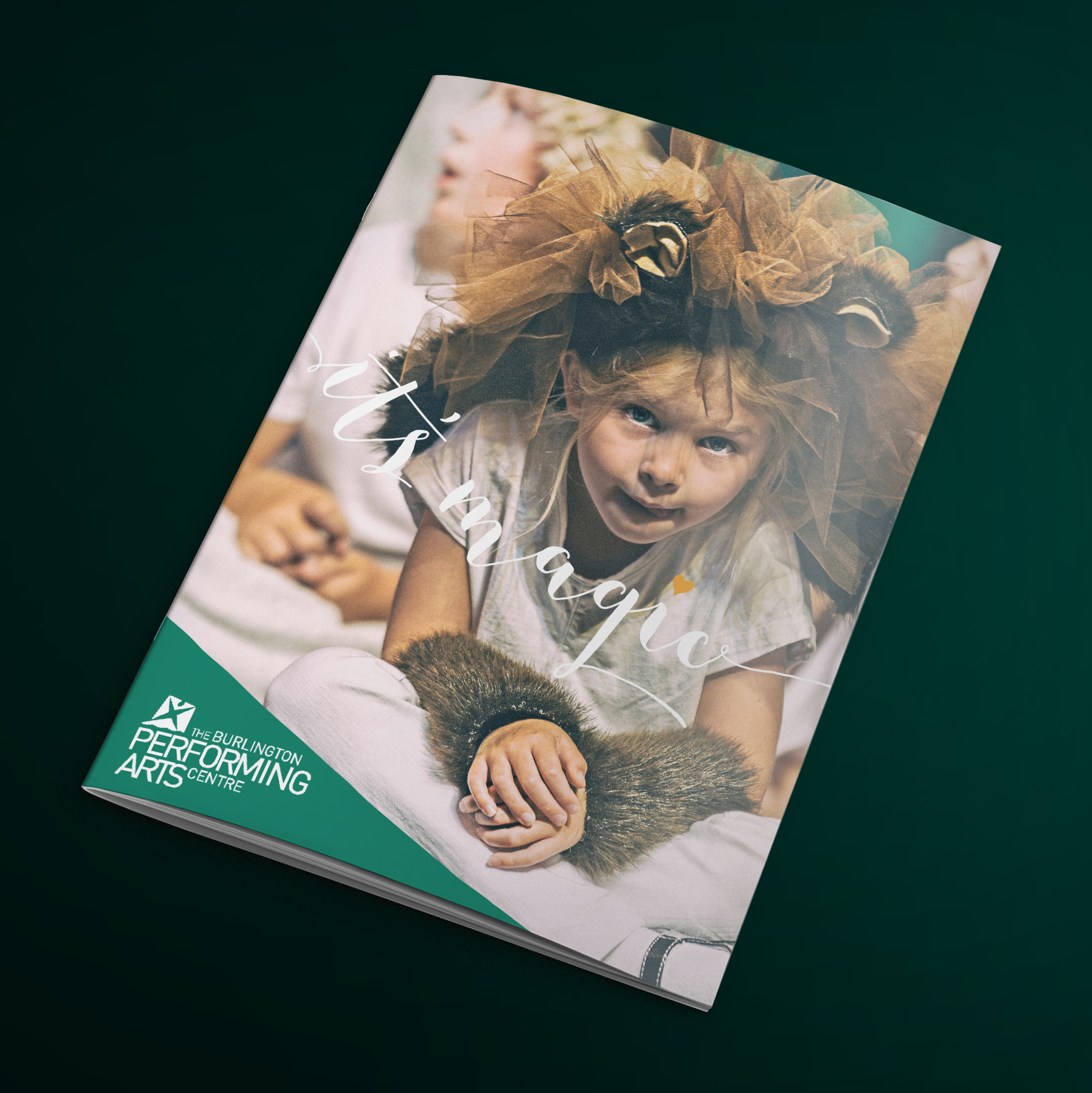
Burlington Performing Arts CentreCommunications

Sol BeautyBranding
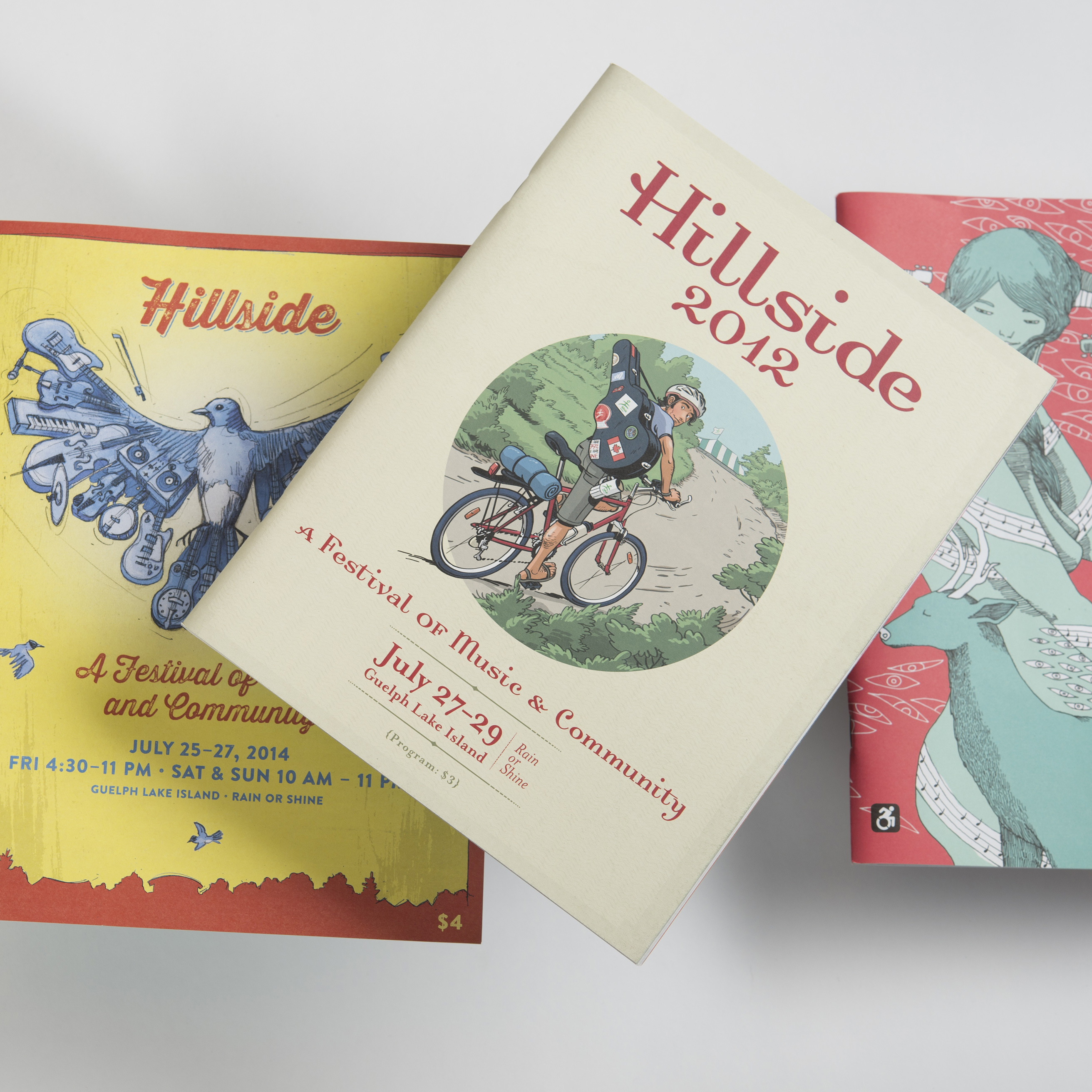
Hillside FestivalPromotion Design

Planet Bean CoffeeBranding

Thomas VideoLogo Design
Against Cruise TestingGraphic Design in the 1980s Toronto Peace Movement
123 Woolwich Street
Suite 102
Guelph ON N1H 3V1
Email: [email protected]
Phone: 519 831 9833
© 2025 Lind Design